Forms are cells in which we leave information about ourselves and send it to the addressee. We send letters, fill out applications, and buy goods. Leave reviews on websites.
All of these are forms.
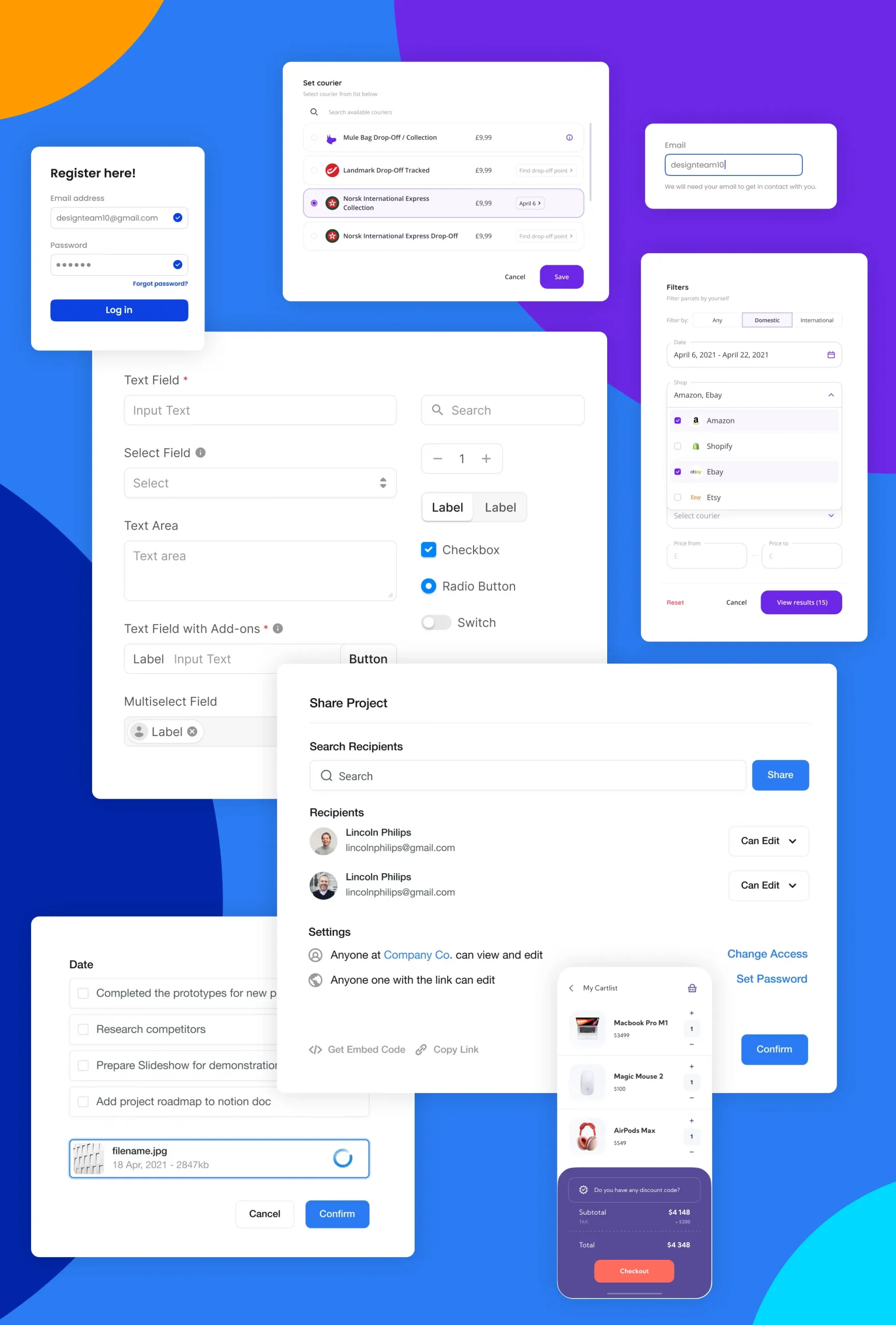
If we talk about a typical form, then it consists of 5 elements:
1. Input field:
This includes text fields, passwords, checkboxes, radio buttons, sliders, and any other field for entering information.

2. Tags
They have an auxiliary value, they tell users what the corresponding input fields mean.
3. Action buttons:
when the user clicks this button, the data is submitted and the form changes to a different appearance.
4. Feedback:
Your message was sent successfully or something like that.
According to this message, the user understands the result of his input through feedback.
5. Errors and correctly entered data.
These messages notify the user of the result of their form submission, which may be successful (indicating that the form was submitted successfully) or unsuccessful (“The number you entered is invalid”).
Forms usually have automatic validation to ensure that the user’s data is valid and entered correctly. That is, in the phone field, we can only enter a phone number, but not an email.

Text fields
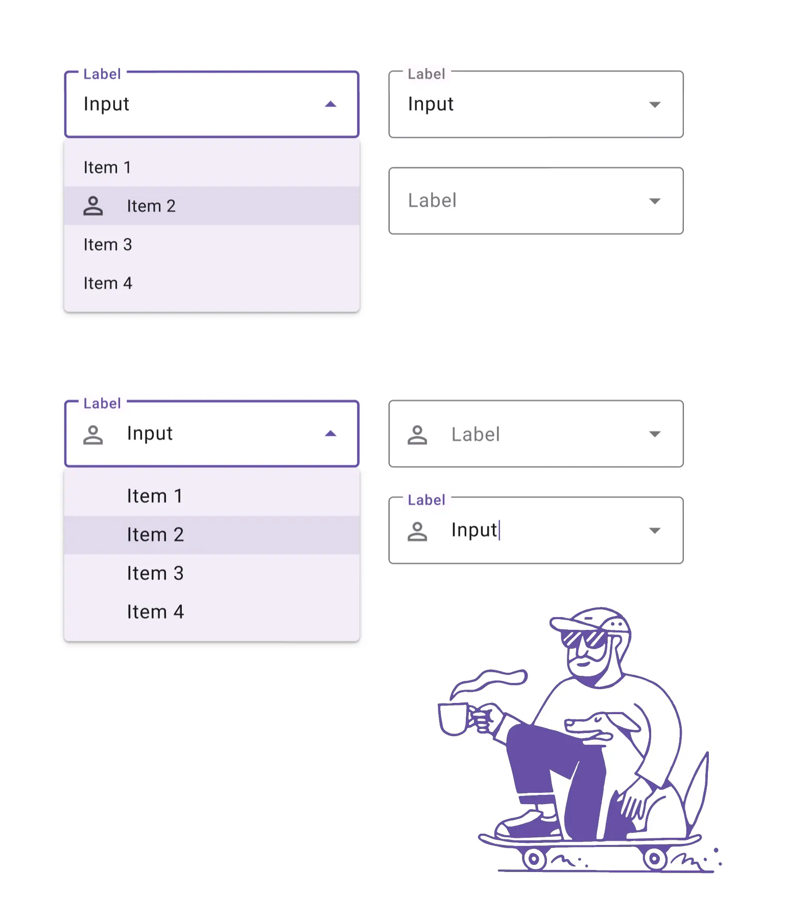
A text box is an area where users enter text data.
Less is better
If possible, it is recommended to adjust the size of the text box to the expected amount of text.
Those. so that people can estimate how much test they need to inject based on the size of the floor.
And of course there shouldn’t be a lot of text. People expect automation from us. They don’t want to answer questions, especially personal ones, or do stupid tasks that marketers want them to do. On which page did you hear about me? Who recommended me as a great designer? Do you really have time to answer these questions?
That is why I am personally in favor of automation and minimalism.
Purpose of the text box
A tooltip should appear at the top of the text box.
Keep it visible when the user enters data.
Tip
The text box can contain an example of fill inside. to tell the user what to type. Since the placeholder text disappears as people start typing, it can also be useful to add a separate label to describe the field to remind others of its purpose.
The future of forms in automation.
We will not need to fill in all the data. All the work will be taken over by the global systems.
I personally like to fill out forms in which all data is inserted automatically.
Log in to the site using a Google account, respond to resumes using LinkedIn.
A bit about robotic forms
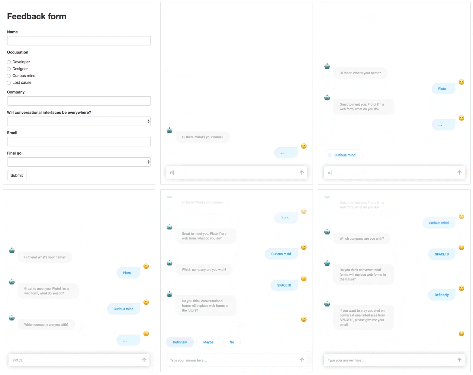
The conversational form is the concept I wanted to talk about. It easily turns any form on a web page into a conversational interface.
This solution presents the user with a more lively experience.
In which he can answer us. No. I don’t want to answer this question. Connect me with the manager. Or help with something. People want to live their free lives.
Below is an example of how it is seen in Adobe.
