Any layout contains elements. And sometimes there are a lot of them. Optical connections and attractions arise between the elements, which obey the theory of proximity and, in particular, the rule of external and internal.
The grid helps you to follow this rule without having to calculate each distance and size individually. You lay down the key patterns once, when building the grid, and then you just stick to them.
Unlike a column grid, a modular grid sets the vertical rhythm and the main proportions of the elements, maintaining them throughout the layout. This is a convenient, flexible and fairly simple system. Provided that you have sufficiently delved into its principles.
Lexicon Design System
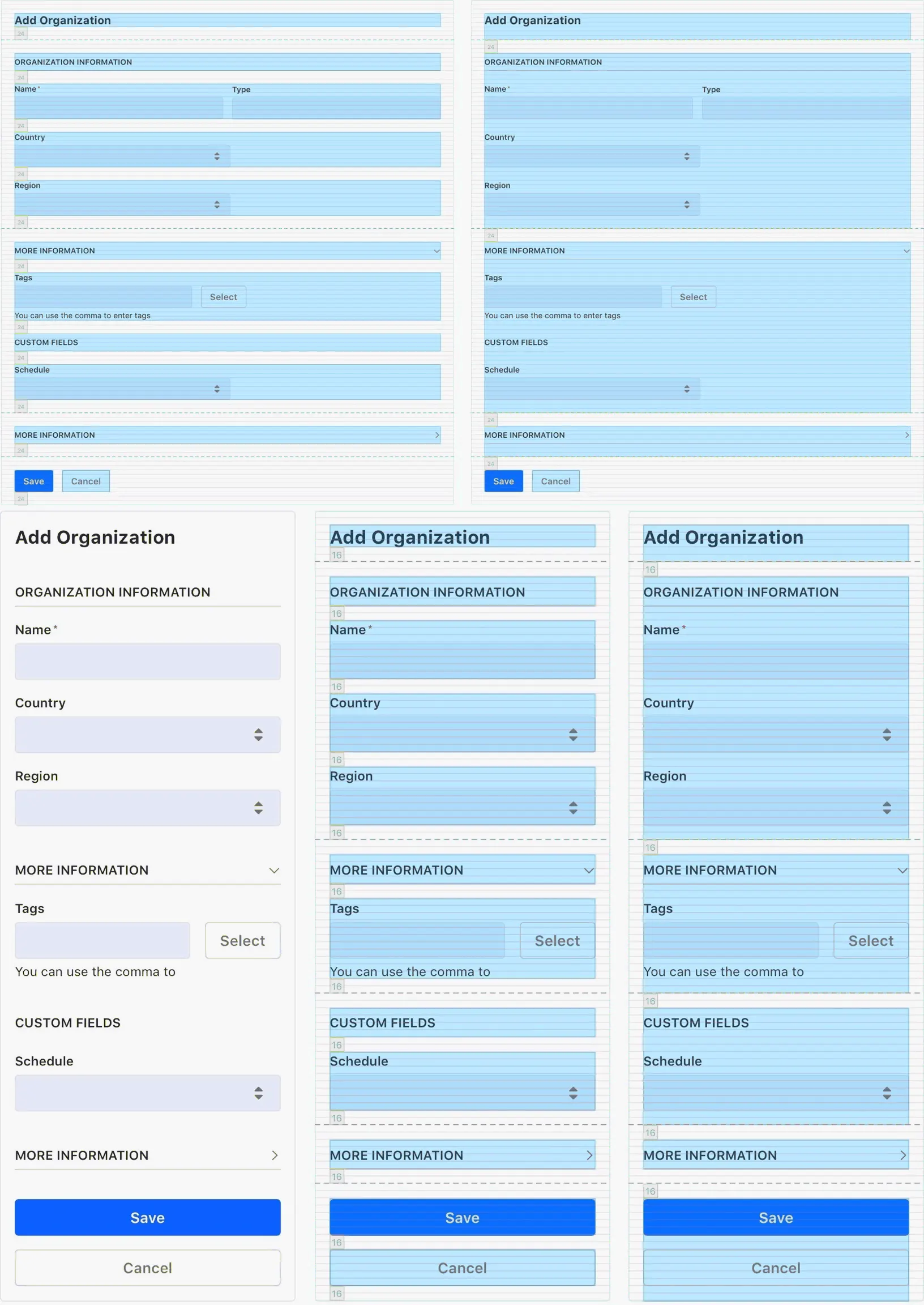
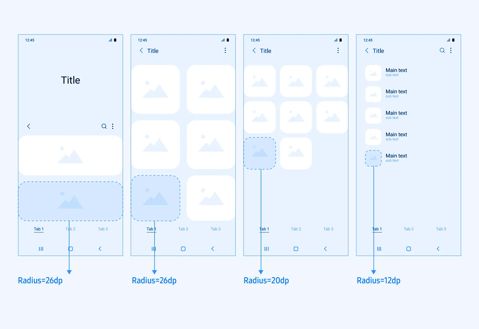
The main grid is the basic standard of the metrics of our system, from which the rest of the system structures are built. Specifies the starting point of dimensions and the padding and borders of UI elements.
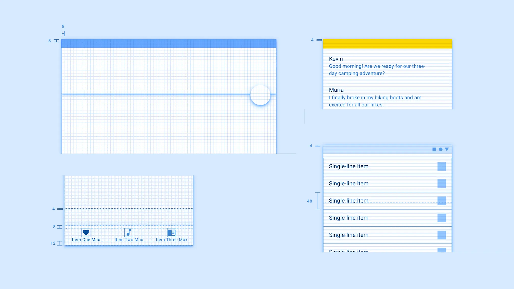
The mesh is built from a base module of 8px, so the size of the elements and the distance between them is always a multiple of 8: 16,24,32,40,48…
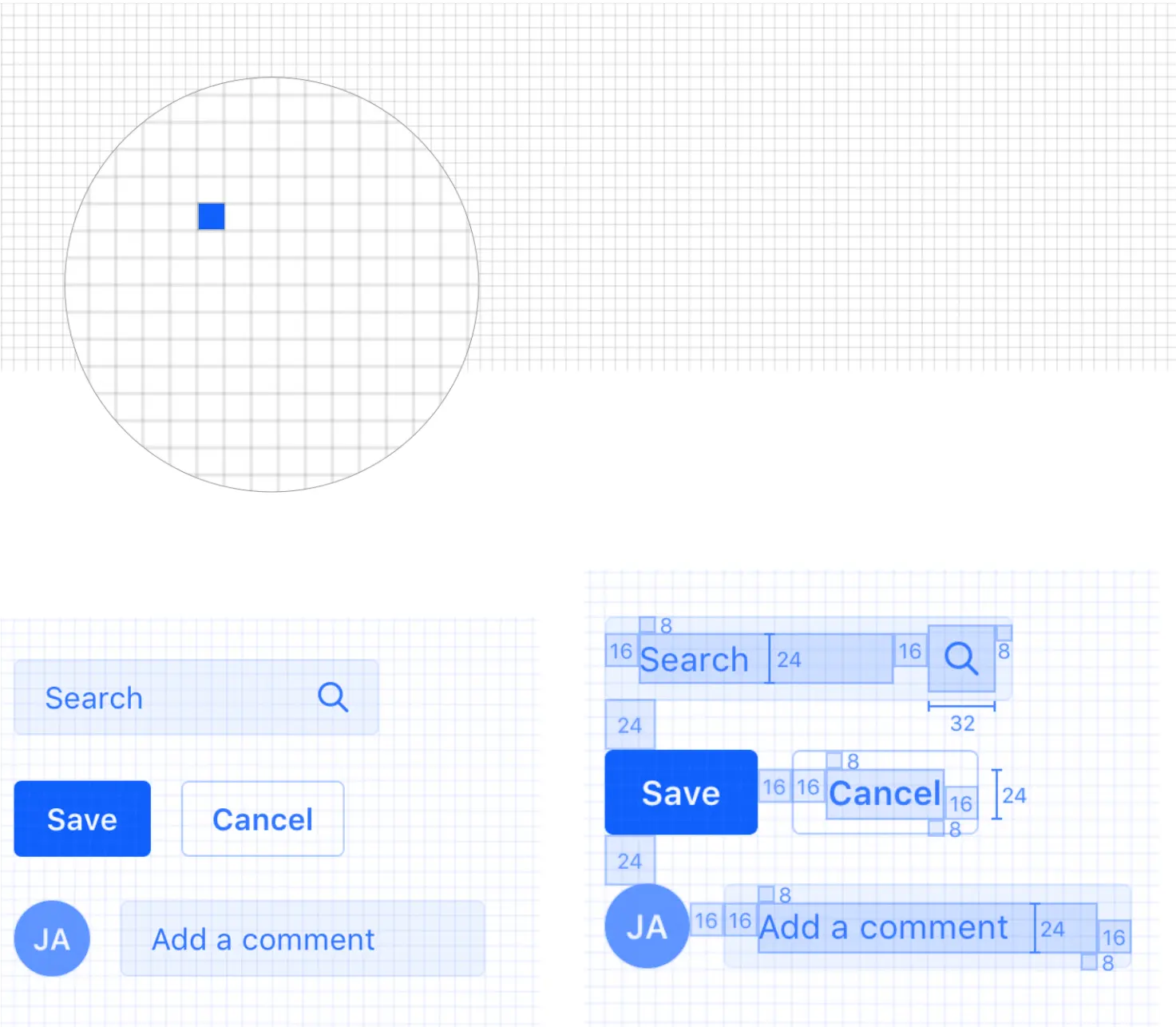
Creates a common metric model that provides visual consistency and consistency between the various elements of the system and their spatial relationships.
This network supports efficient workflows, reduces design decisions, and creates a common visual language for designers and developers.
Specifying 8 pixels as a measure helps maintain visual consistency and allows you to take advantage of other benefits. However, there may be situations where a value of fewer than 8 pixels is required. In such cases, the 4px module can be used.
 Values below 8 pixels are related to the anatomy of the underlying UI elements, not to element spacing and page composition. Using atomic design terminology, these minimum dimensions should be used almost exclusively to describe the internal anatomy of elements such as atoms or molecules. Always make sure that the frame containing the element fits within the 8-pixel base grid.
Using the Grid in Apple
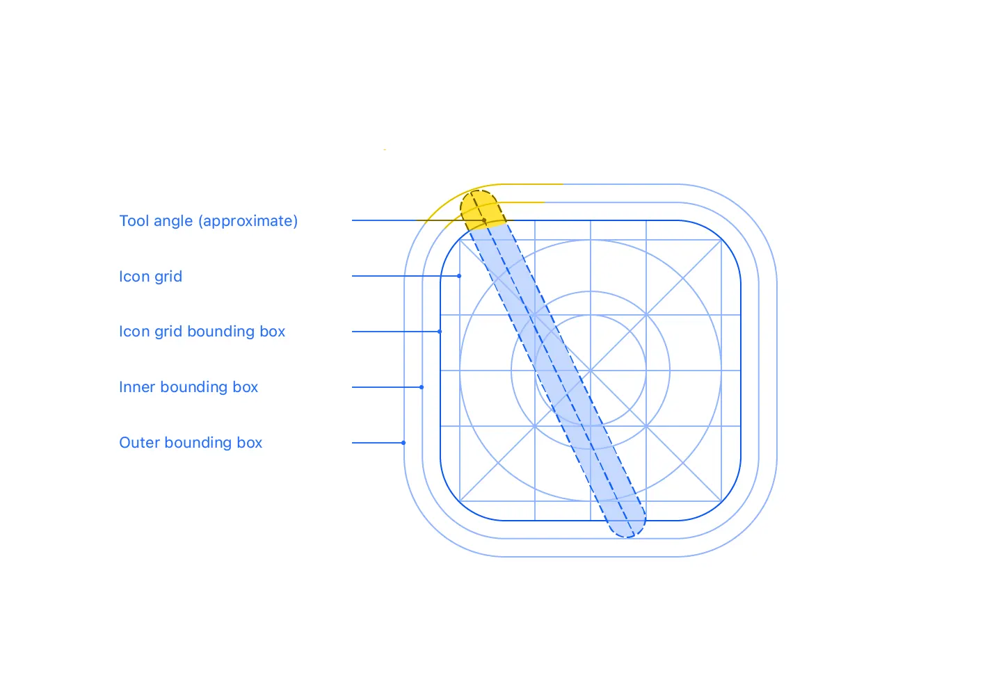
Here’s an example of how Apple works with the modular grid when creating icon designs.
The design system suggests using a grid to aid in the positioning of elements in the symbol and to ensure that the centered interior elements, such as circles, are consistent in size with other symbols in the system.
The main content is kept within the boundaries of the icon grid; all symbol content is contained within the outer bounding box. That is, if you’re using the tool on an icon, for example, it’s a good idea to align the top edge of the tool with the outer frame and the bottom edge with the inner frame, as shown below.
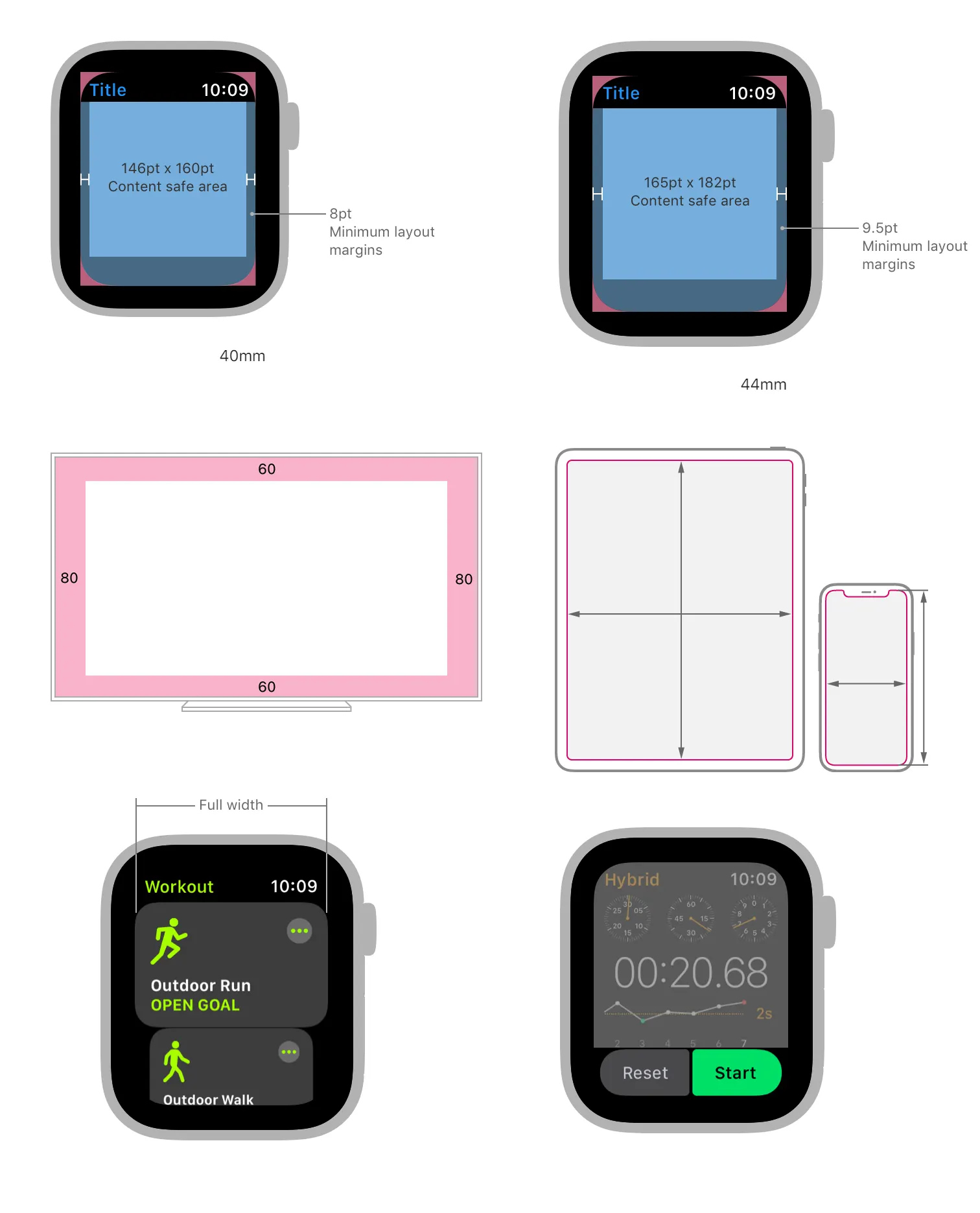
It seems to me that the trend in design is towards getting more padding between visual elements and increasing the size of the elements themselves. Use the entire screen space of the device as much as possible. If you pay attention to how Google watch elements or Samsung design elements are laid out, then you will understand what I mean.
Material Design Grid System
The Material Design layout system also uses base grids and keylines. As well as padding and extra spacing to customize design elements.
Carbon Design Grid
The IBM design system is also built on a grid of multiples of 2, 4, and so on.
Why do almost all systems use 12-column grids?
Everything is simple here. The number 12 is divisible by 12, 6, 4, 3, 2. Therefore, the grid is flexible and allows you to organically typeset blocks of almost any number or width. Moreover, by discarding 1 or 2 columns at the edges of the layout as margins, you get a block in the center that is also divisible by 10 or 5.
I’ll add from personal experience that it’s very convenient to draw responsive layouts based on a width of 1200 pixels, especially without column spacing. You get 12 columns with a nice width of exactly 100px and you constantly orgasm with round numbers as you work.