Action lists display a list of actions or options that can be selected. This component is typically placed in a pop-up container to create a drop-down menu or allow sellers to select from a list of options.
What are these dropdown design elements used for? So that users are not distracted by secondary tasks. It can also be used for a set of actions that won’t fit on the available screen space.
Shopify Design System
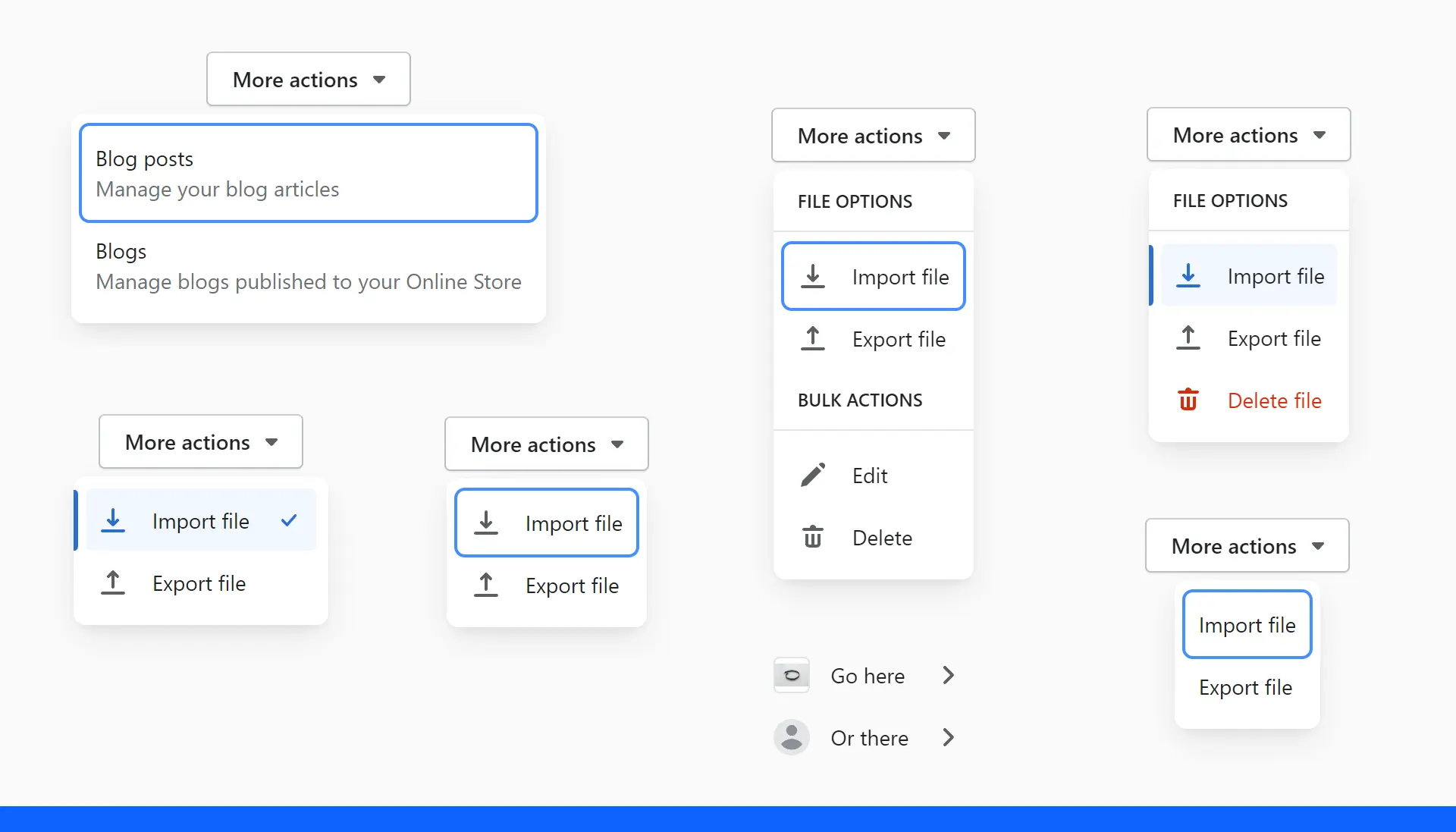
They are used for secondary or less important information and actions, as they remain hidden until salespeople reveal them by opening a pop-up window.
The action list contains related actions
Each item on the action list should be clear and predictable. Sellers should be able to predict what will happen when they click on an action item.
Each item in the list of actions should always begin with a strong action verb. To provide sufficient context, use the {verb}+{noun} format unless the action is just a verb.
Each item in the action list should be searchable, avoiding unnecessary words and articles such as, or.
Action Sheet
Use the action sheet when:
- You need more than one option.
- It is very important for the user to stay in phone mode.
- You have a few actions.
Do not use the worksheet if:
- There is only one option on the menu. In this case, consider using a button.
- You should see a list of top positions. In this case, use the menu button.
- Your users will benefit even more from a share button that provides easy-to-use default functions with the option to activate other actions.
Apple design system about pop-up buttons
The pop-up button displays a menu of mutually exclusive options.
When users select an item in the pop-up button’s menu, the menu closes and the button can update its content to reflect the current selection.
When to use it?
Use the pop-up button to display a flat list of mutually exclusive options or states. A pop-up button helps users make decisions that affect their content or appearance. Use a drop-down button instead if you:
- Suggest a list of actions
- Let people select multiple items
- Add a submenu
Provide a useful default choice. The pop-up button can update its content to identify the current selection, but if users haven’t already made a selection, it will display the default item you specified. If possible, make the choice the default item, which most people are likely to want.
Let people provide options for the popup button without opening it. For example, you can use an introductory or button label that describes the action of the button by providing context about the options.
Consider using a pop-up button if space is limited and you don’t need to constantly see all the options. Popup buttons are a simple and logical way to present a variety of choices.
Dropdown buttons in Apple Design System
A dropdown button displays a menu of items or actions directly related to the button’s purpose.
Visually, it looks like a regular drop-down menu. However, the meaning of the drop-down menu is to display the topic of discussion, to describe the various services, and the meaning of the buttons with these menus is to group many functions in one place on the screen.
When the user selects an item from the button dropdown, the menu closes and the application performs the selected action.
What does Apple recommend?
Use the drop-down button to display commands or items directly related to the button’s action. You can use a menu to help users modify a button’s purpose or customize its behavior without having to use additional buttons in the user interface. For example:
- The „Add“ button can be a menu that allows users to specify the item they want to add.
- The „Sort“ button can use a menu that allows users to select an attribute to sort on.
- The „Back“ button allows users to select a specific location to revisit instead of opening the previous one.
Let people know when a dropdown item is destructive and ask them to confirm their intent. The menu uses red text to highlight activities you consider potentially destructive.
When people choose a malicious action, the system displays a list of actions (iOS) or a pop-up window (iPadOS) where they can confirm their choice or cancel the action.
Use separators to visually group related items in a button’s dropdown menu.
Creating visual groups can help users browse the menu faster. For example, the More button in the Files app uses delimiters to help users distinguish between actions that affect content and actions that affect browsing and sorting.
Do not use more than three visual groups.