Buttons in Carbon Desing System
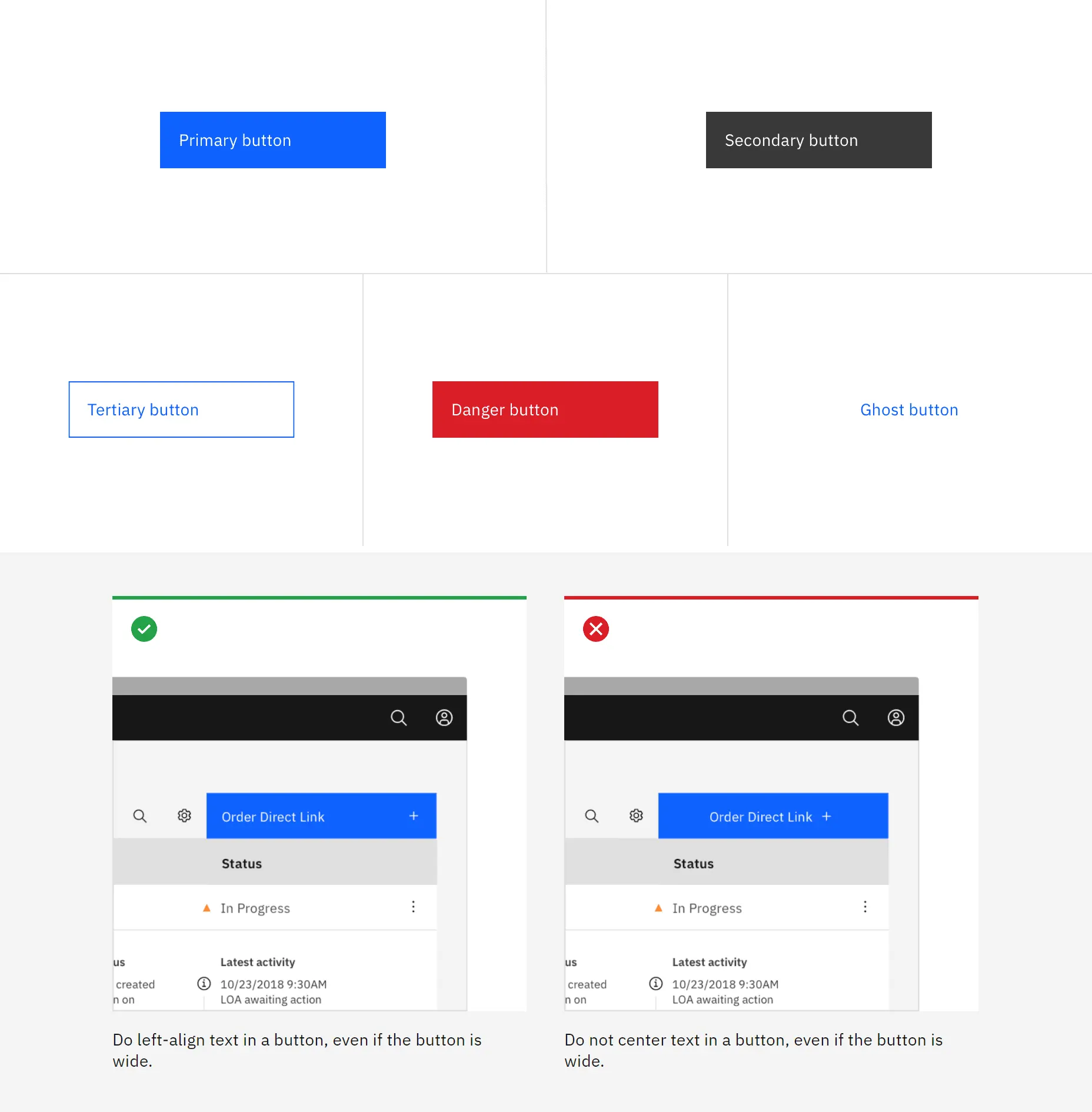
Buttons are divided into:
Basic – for the main call to action on the page. Primary buttons should only appear once per screen (no app title, modal dialog, or sidebar).
Secondary – for additional actions. And yes, the extra buttons can only be used in conjunction with the main button. The function of the secondary button is „Cancel“ or „Back“.
Tertiary – used for independent actions or together with the primary if there are multiple calls to action.
Danger
For actions that may have destructive consequences for user data (such as erasure or erasure). The Hazard button has three styles: primary, tertiary, and ghost.
Ghost – is minimal information. Connection No outlines.
I like that ABM has a system of hanging buttons that do not line up with the main design. This creates a pleasing asymmetry.
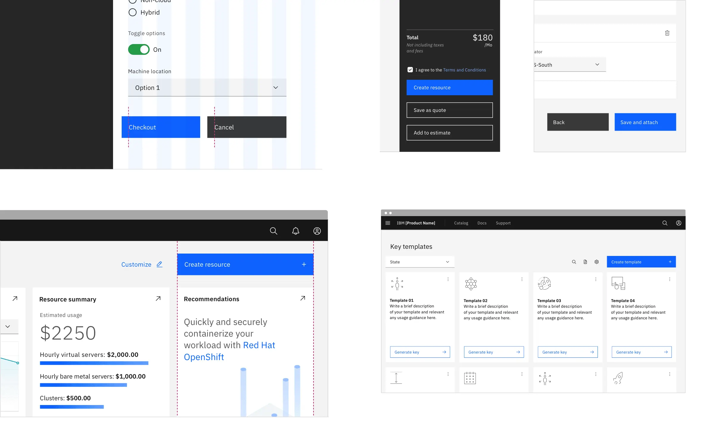
The buttons fit thoughtfully into the design layout of the page.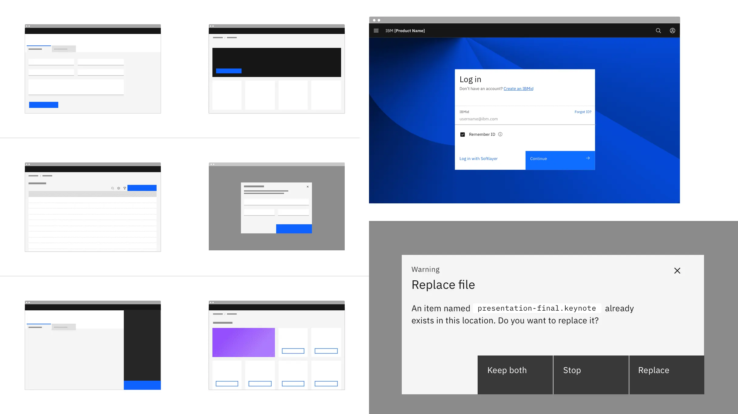
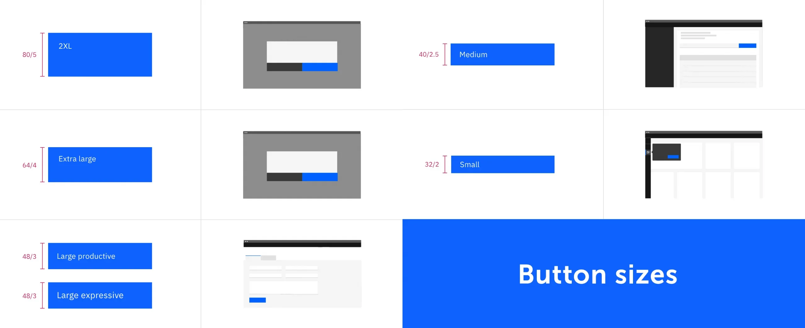
Button sizes are also multiples of the grid design and are 16, 24, and 32 pixels.
Material Design and using Buttons
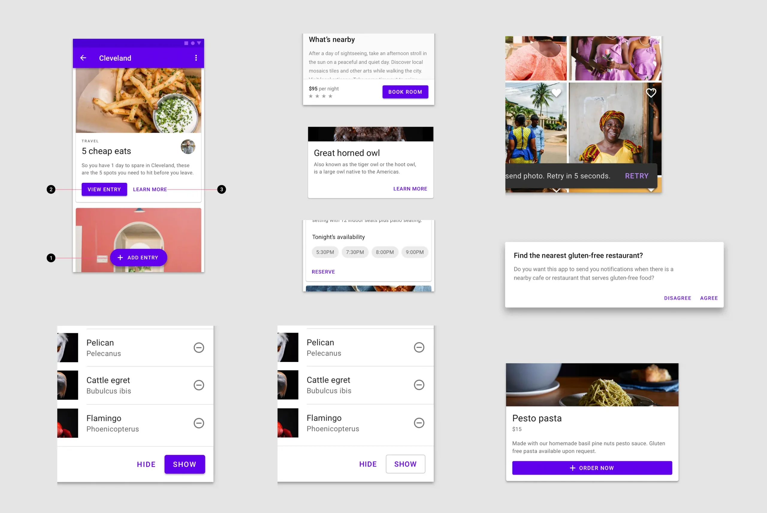
I like to explore where on the screen different design systems place their buttons. For example, in material design, an active, main button is most often placed on the edge of the block. Listed on the left side of the card. At the end of the list – on the right side of the block.
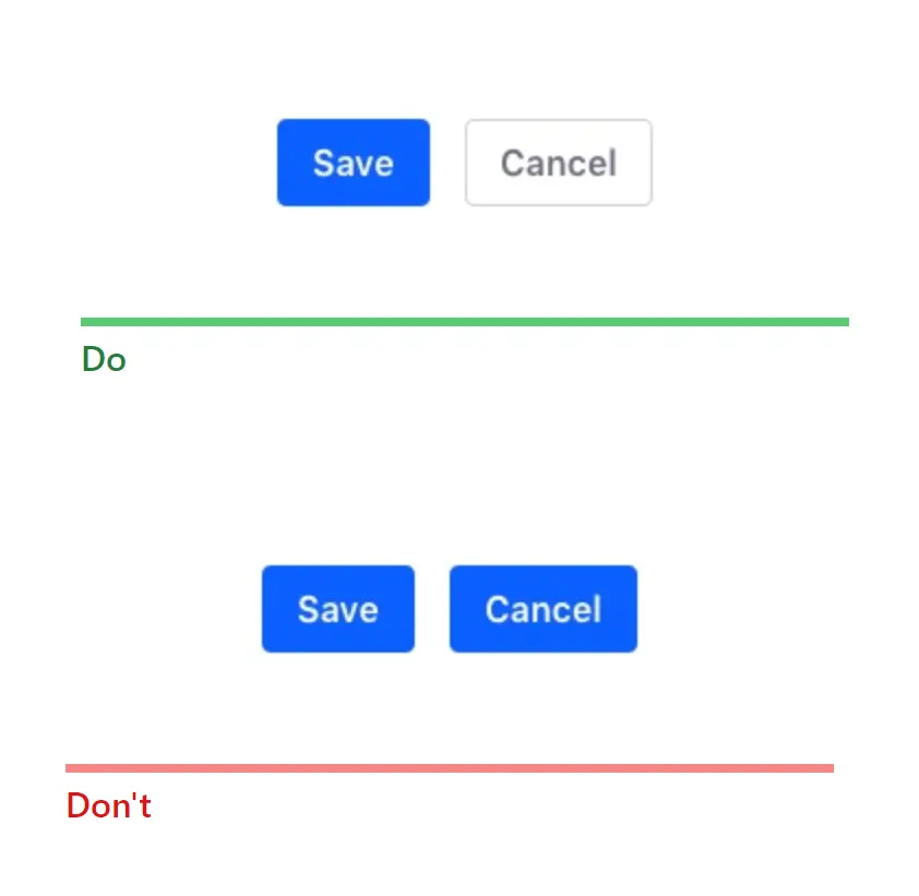
Buttons in Windows
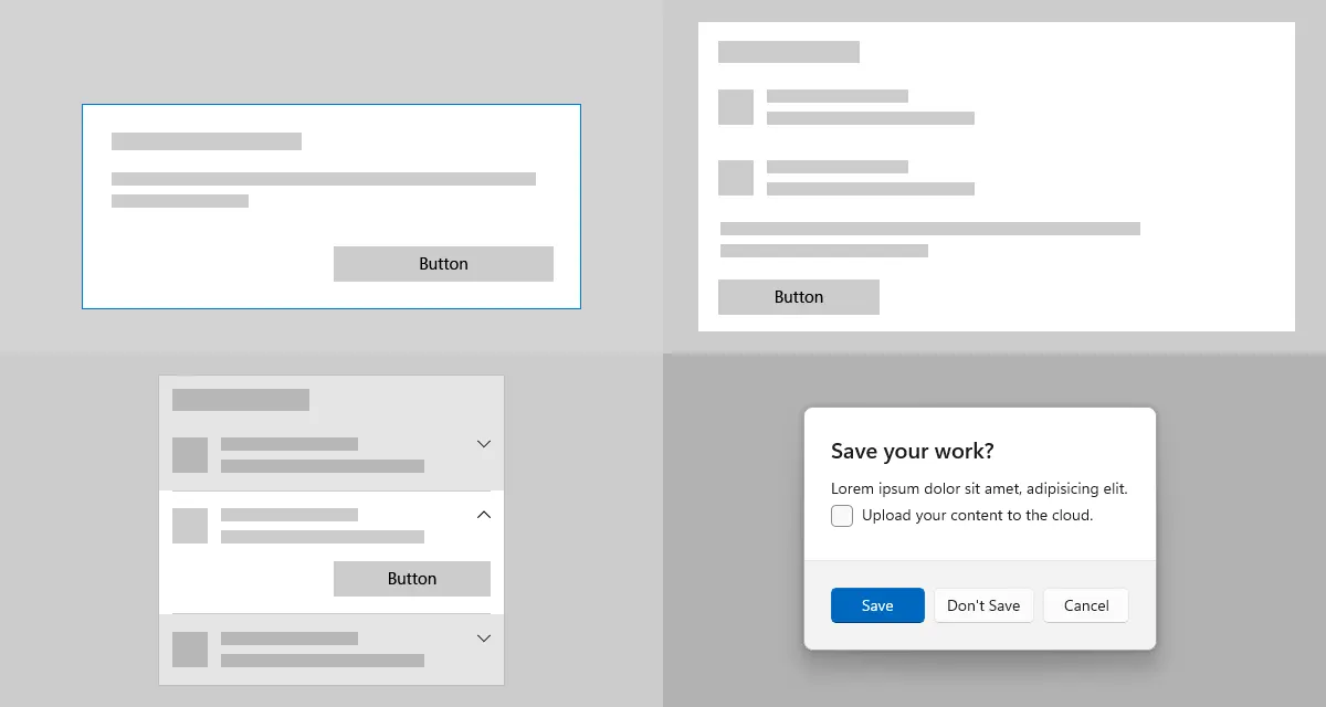
In Windows, buttons can be arranged in order from left to right. From active to inactive. An active button on the left and two secondary buttons on the right. See below for the Save button.
Buttons in Adobe Spectrum
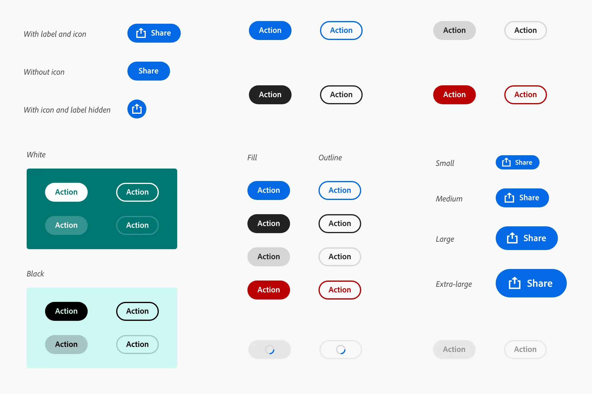
The types of buttons in the Adobe system are also based on the principles of the accent color of the main button and its other types. With or without an icon. With or without outline.
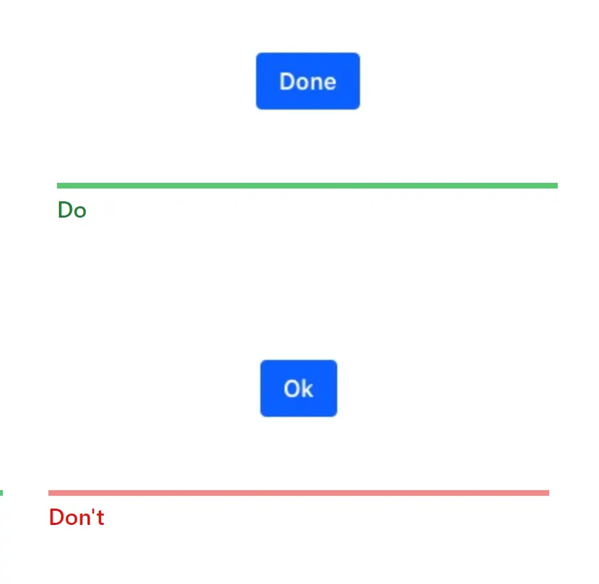
Lexicon Design System
- Never use two main buttons at the same time. There should be only one primary button representing the most important action.
2. Always use specific words, not general ones like „OK“.