Shell header in the Carbon design system
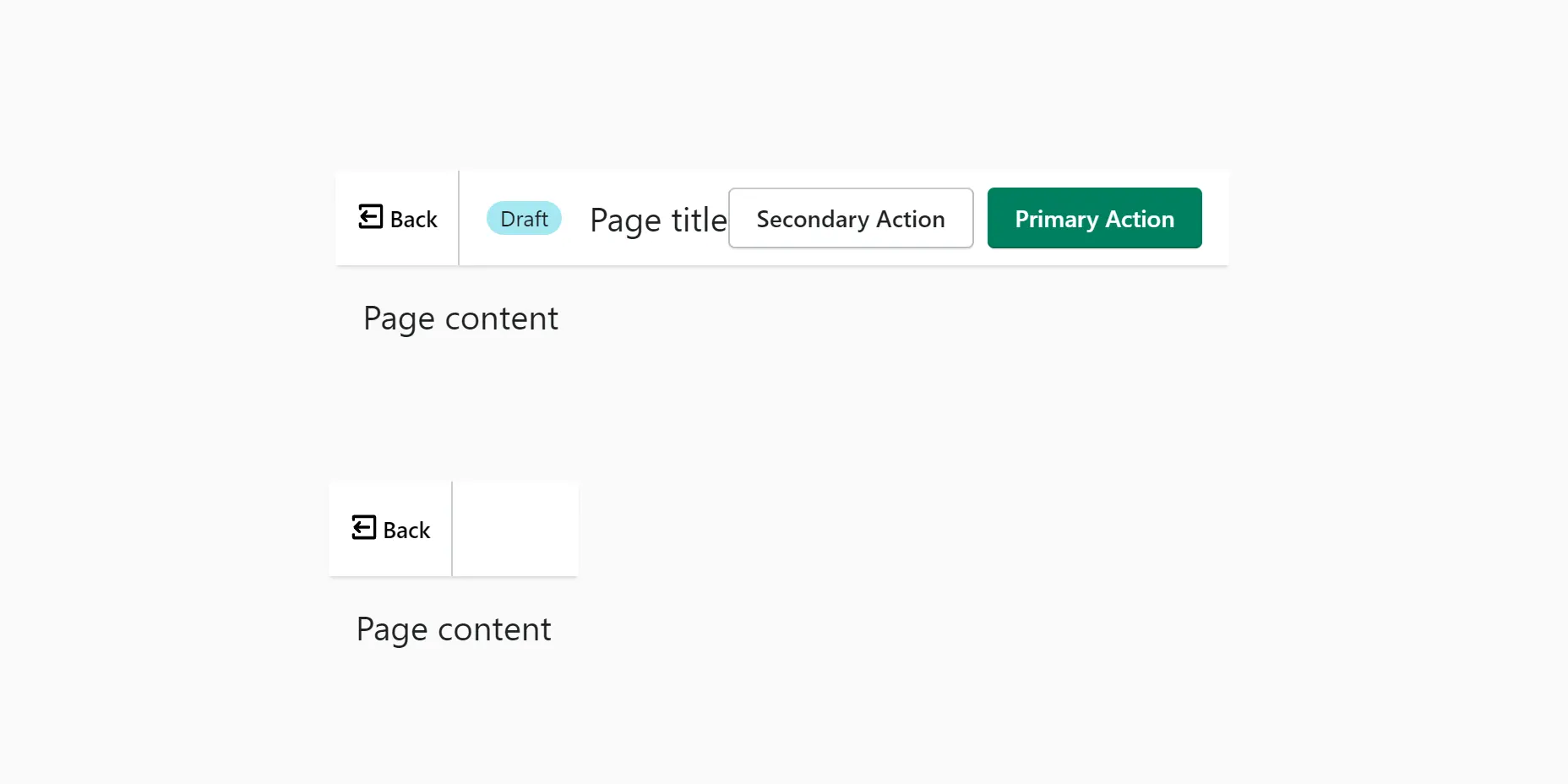
Anatomy
The horizontal menu takes up the full width of the viewport and is the tallest element in the browser window.Often the entire menu bar is saved throughout the work with the product. Or it appears when you scroll up the page.
The left side of the menu contains items related to product management. By moving to the right in the header, the functions become more global. The items in the middle of the header should represent system-level controls. The items to the right of the header, e.g. B. radio buttons, have the widest global scope and can involve the management of multiple products or groups.
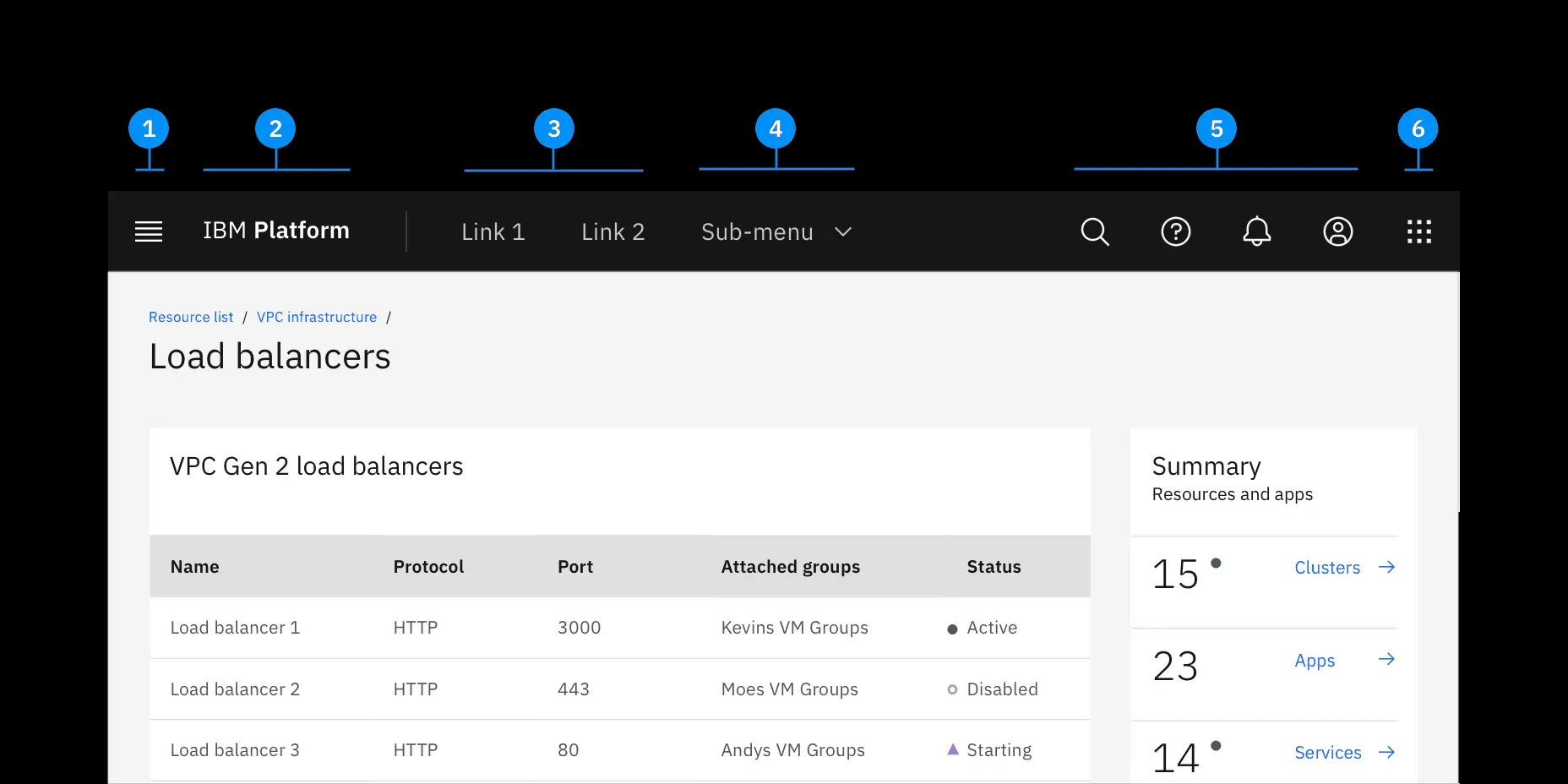
1. Hamburger menu
The product navigation is opened via the hamburger icon. A hamburger menu is only necessary if there is additional navigation on the website or app.
2. Product name or logo
3. Header links
Header links are supported as product navigation where required.
If there isn’t enough screen space, the links curl up into a side menu.
4. Submenus
Submenus are served as product navigation when needed.
5. Header tools are used for general system functions like profile, search, notifications, etc.
6. Switch
The switch allows the user to easily switch between the product and the system.
Function Menu
 In the function menu, the order of the menu items is important.
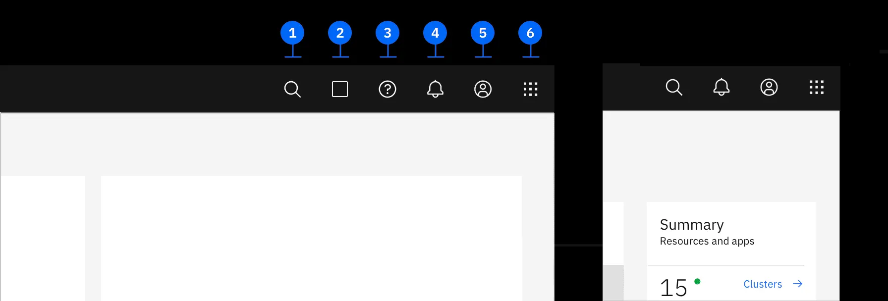
1. Search
The search comes first because this menu has its own property to expand by clicking on it and on the left will not interfere with another element in the expanded form.
2. Other icons. There may be arbitrary product icons. Usually no more than three. It is important to highlight the main properties of the product immediately in a prominent place for the user.
3. Next comes the Help.
4. Notifications are closer to the right side and usually become the third from the right.
5. The account is always second from the right. This important link gives the user quick access to their account from any page of the product interface.
6. The switch of transition between systems.
Read more about IMB aproach
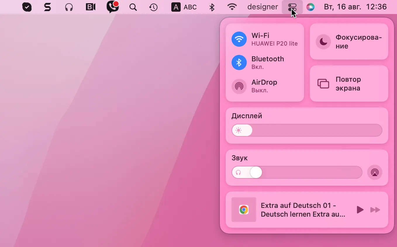
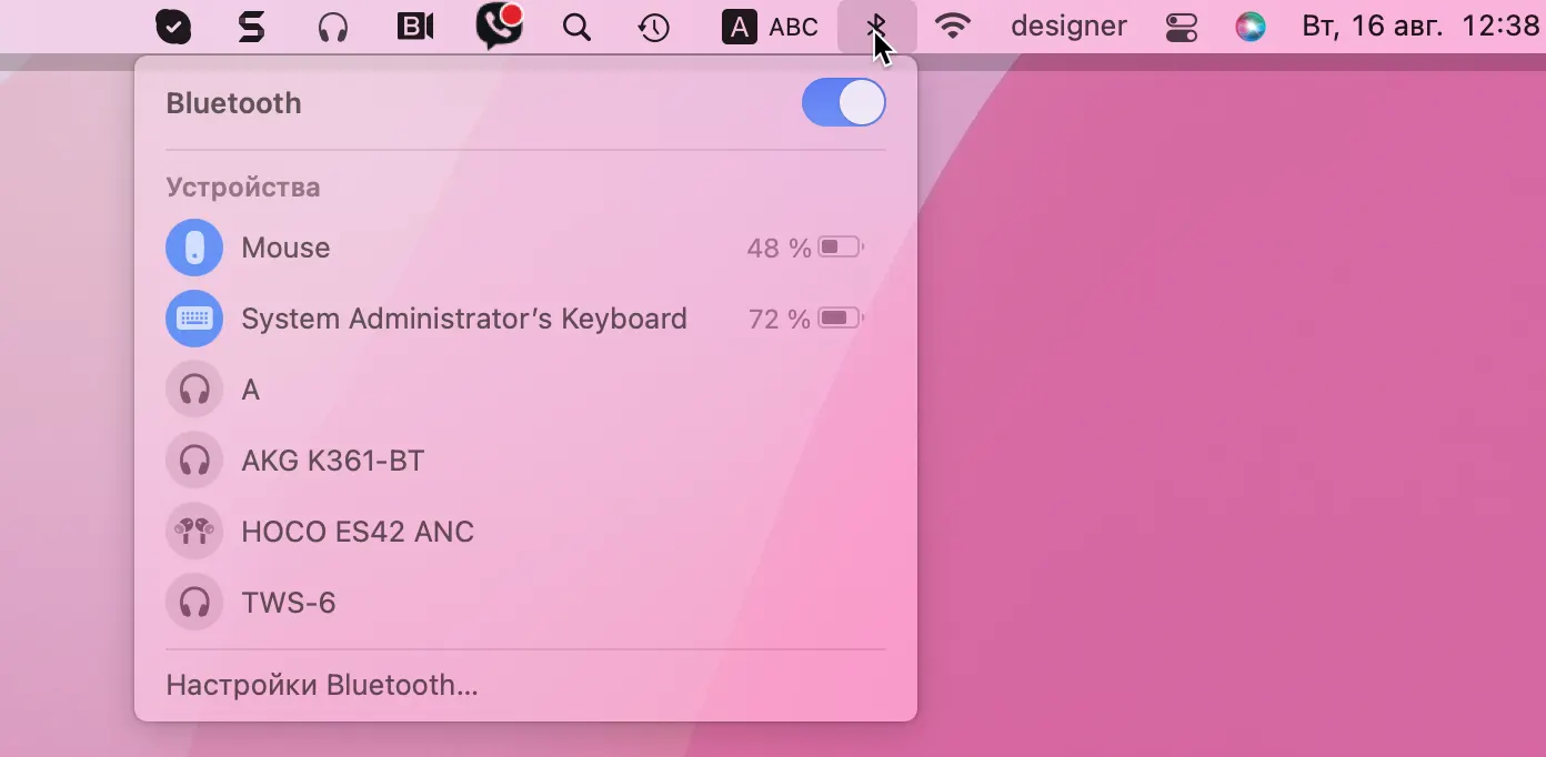
Apple menu bar
On a Mac, the menu bar at the top of the screen displays the top-level menus in your app or game, which typically include both system and user menus.
The Apple Menu, which is always the first item at the front of the menu bar, includes system-defined menu items that are always available. You cannot change or remove the Apple menu.
Menus in the menu bar share most of the common appearance and behavior characteristics of all menu types.
Often, all applications on a poppy have the following structure of the top left menu.
They include the following items and are in order: application name, file, edit, format, and view. Next is a menu with individual items used in a particular application, if any.
And the menu ends with a section window and help.
If space permits, the system can display additional menu bar items.
With the exception of the main additional elements of the menu bar, such as Clock or Bluetooth, language switcher, Siri, and other functions provided by the system.
More about Apple menu bar
Fullscreen bar in Polaris System
The Shopify system has its own term for the wide horizontal menu of the program – Full-Screen Panel.
This is the header component that should be displayed at the top of the application when it is in full-screen mode.
In fact, the function of this menu is identical to the same as in other design systems.