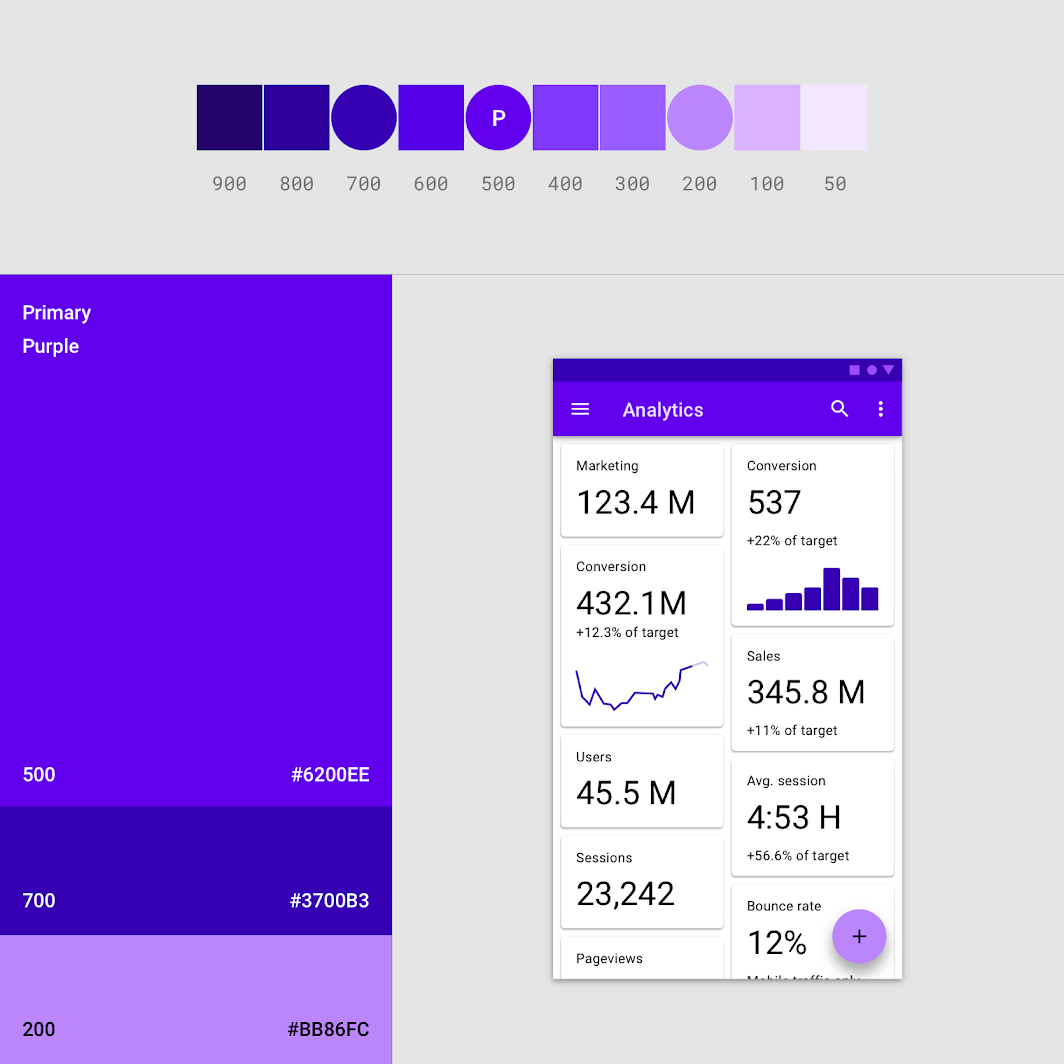
Material Design Colors
Material Design has a built-in base theme that you can start using right out of the box.
These include standard colors:
- primary and secondary colors
- Primary and secondary color options
- Additional UI colors such as background, surface, bugs, typography and icon colors.
All these colors can be adapted to your application.
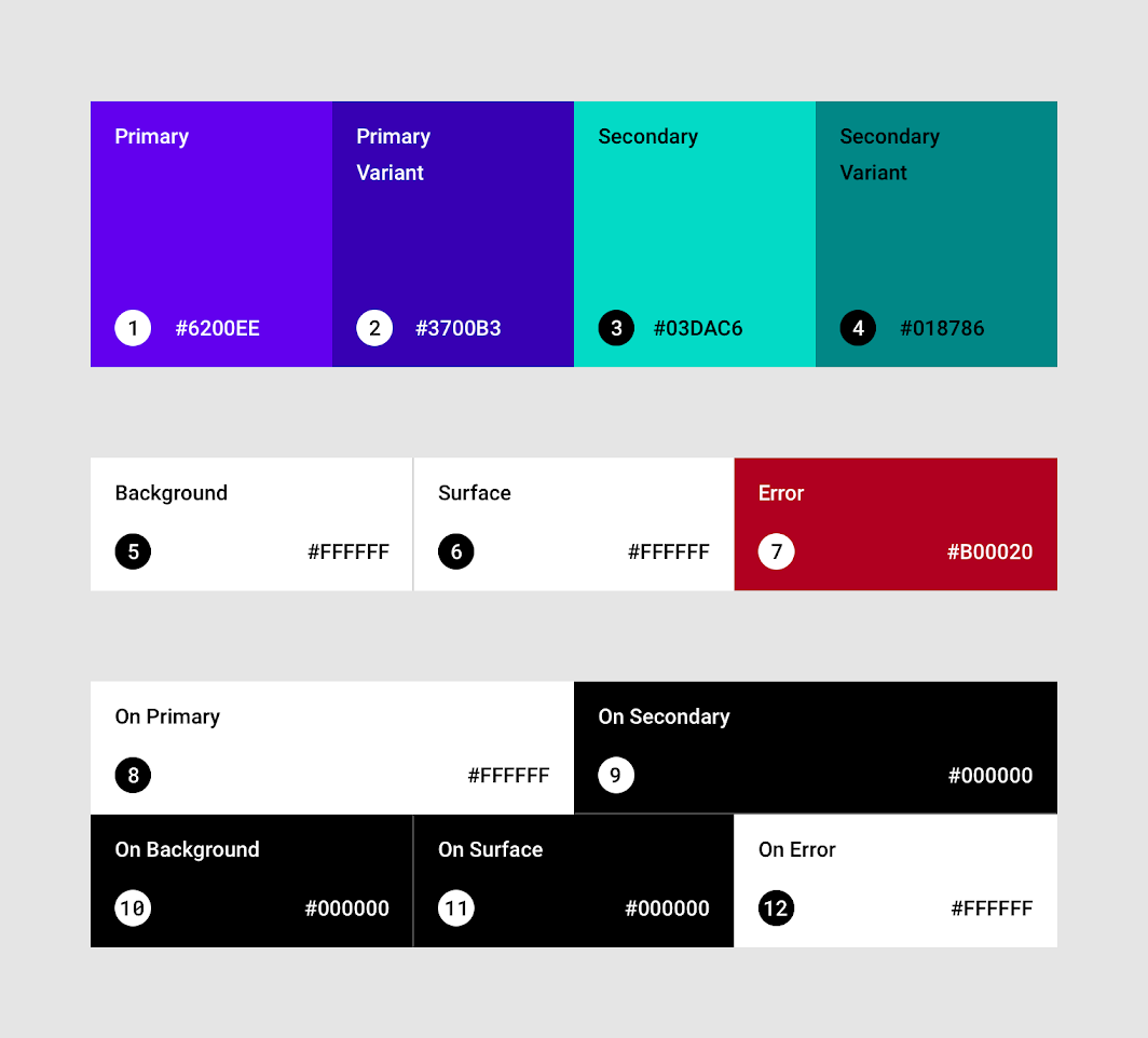

The top app bar uses light and dark variations of the main color to distinguish it from the system bar.
Create beautiful, useful products faster. Material Design is a customizable, open-source platform that enables teams to create high-quality digital environments.
Spectrum – Adobe Color System
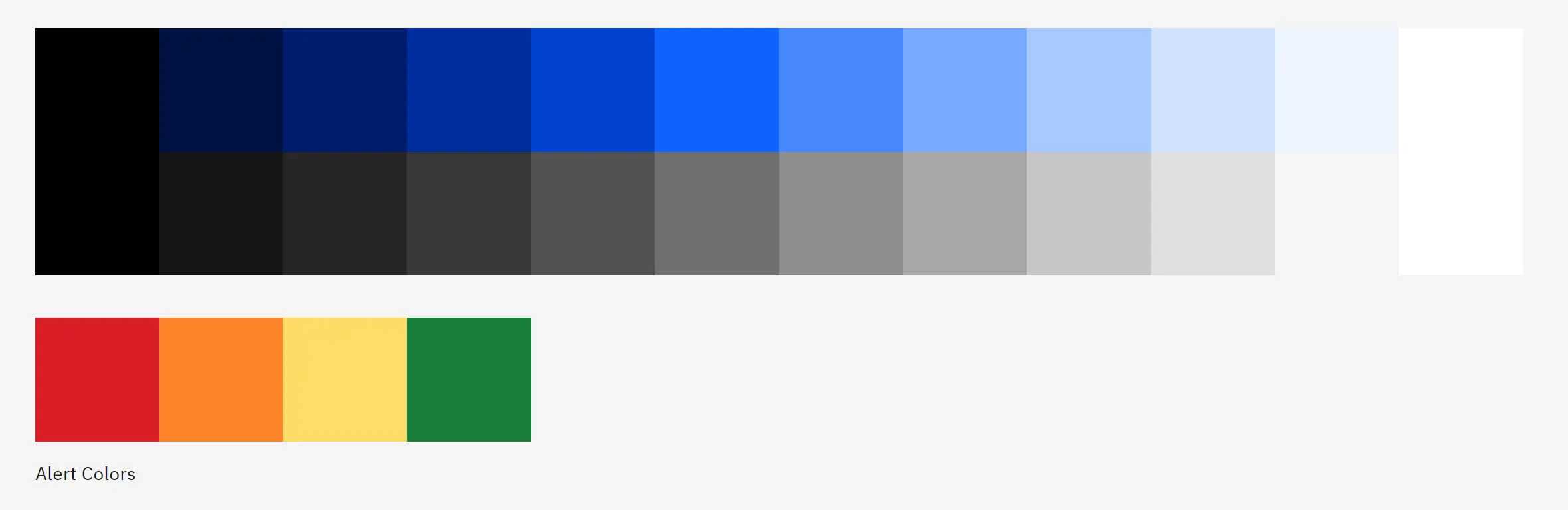
Spectrum uses 13 colors for each color theme with a set of 14 shades and shades for each color. Colors are used sparingly and consciously to strengthen hierarchies and create clear communication channels. Using too many colors can be visually overwhelming and degrade user experience.
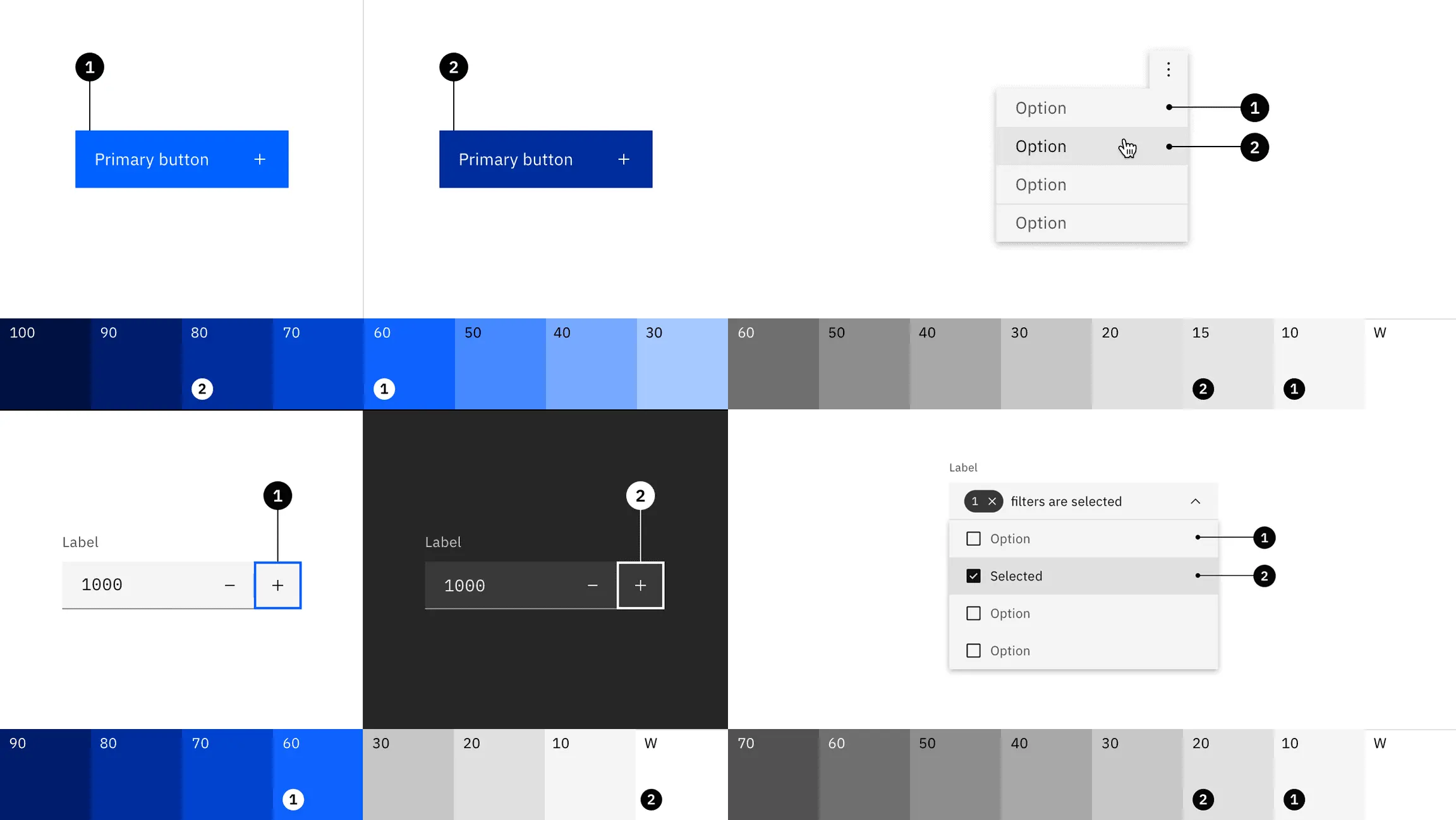
Colors give users context within their workflow and create a hierarchy of actions within the UI. Items in a selected or keyboard focus state are given visual importance since they relate to a user’s immediate actions.
Colors for backgrounds, borders and text
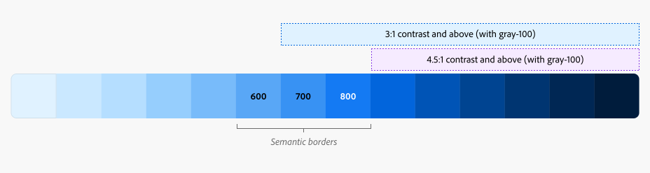
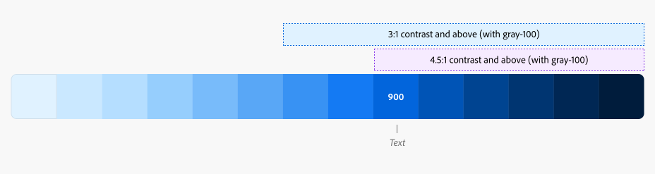
Color semantics
Spectrum assigns common values to a subset of colors to create consistent user expectations. These values are codified in design tokens and used in all components.
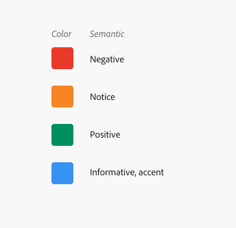
Semantics can be used in many ways to convey meaning. The semantic meanings of the spectrum include information, emphasis, negation, attention, and positivity. Use semantic colors to clearly and predictably convey the appearance of a component. If a color with semantic meaning is used, the text or icon should also be displayed to ensure that the meaning is not lost to users who cannot see or distinguish between colors.
Color transparency
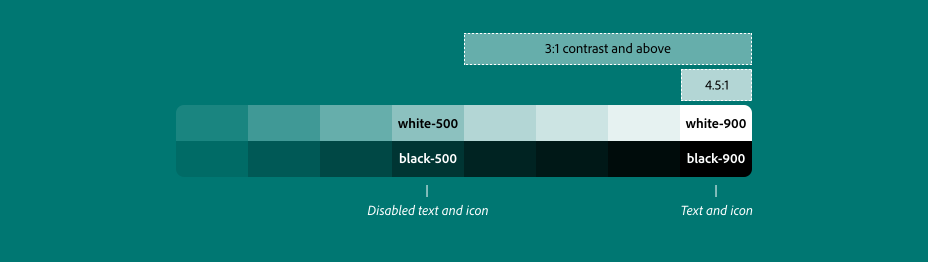
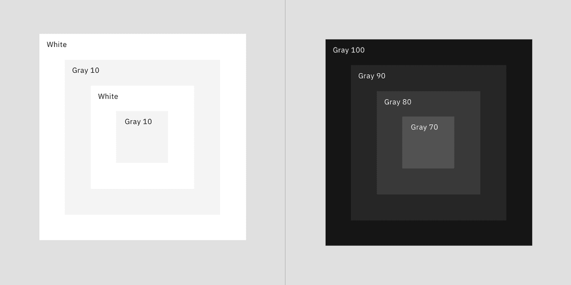
Spectrum offers a set of 8 white and black values using transparency. These colors convert gray to a format that can be applied to colored backgrounds or images.
Transparent white or black background
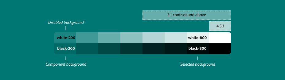
Borders transparency
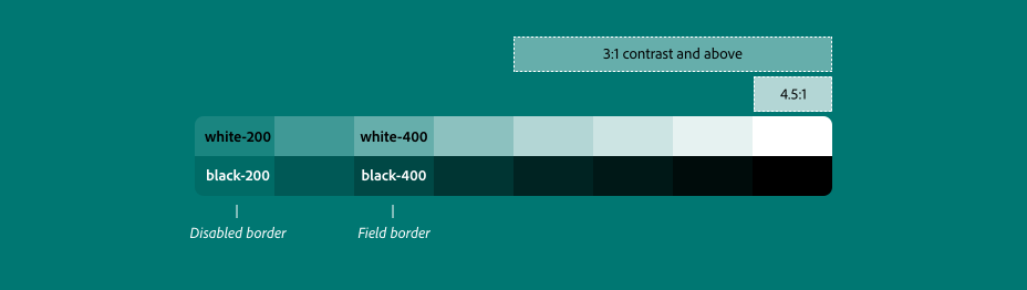
Text and icons colors
Spectrum provides interface components, resources, and tools that enable teams to work more efficiently and make applications more consistent.
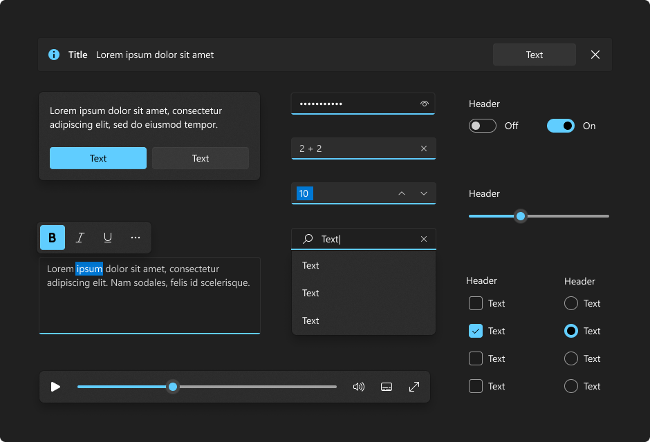
Color in Windows 11
An overview of where and how color is used in Windows 11
Windows 11 color system helps users focus on their tasks by showing the visual hierarchy and structure between UI elements. The colors are context-sensitive to create a soothing background, subtly enhance the user experience, and only highlight important elements when necessary.
There are two color modes: light and dark.
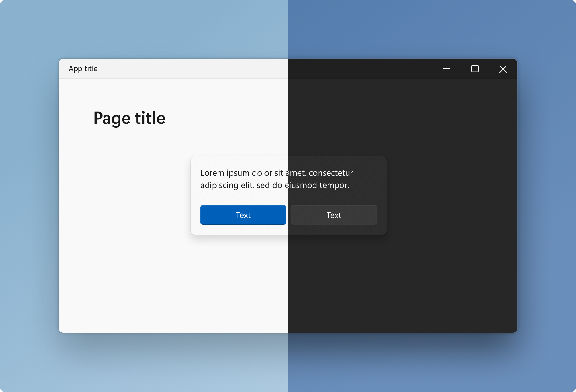
As in the Material Design framework, highlight colors are used to highlight important UI elements and indicate the state of an interactive object or control.
Backlight color values are automatically generated and optimized for contrast in both light and dark modes.
Illumination colors are used sparingly to highlight important elements and convey information about the state of interactive elements.
IBM color design system
Carbon is IBM’s open-source development platform for digital products and experiences.
At the core of this system is the IBM Design Language, which consists of working code, design tools and resources, human interface guidelines, and an active community of contributors.
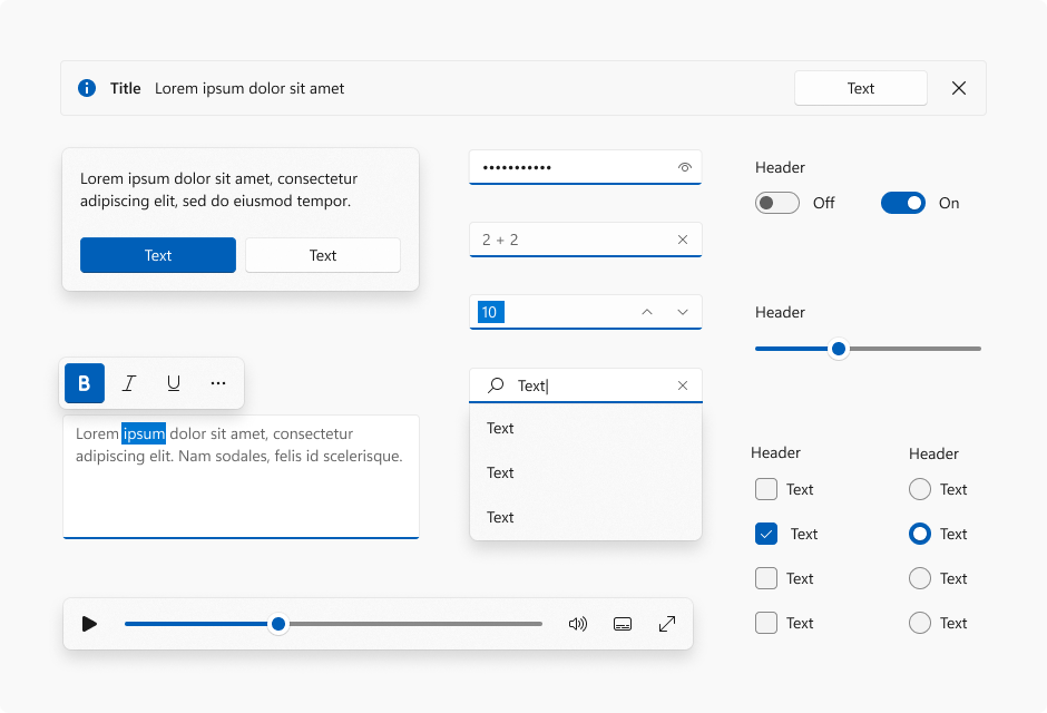
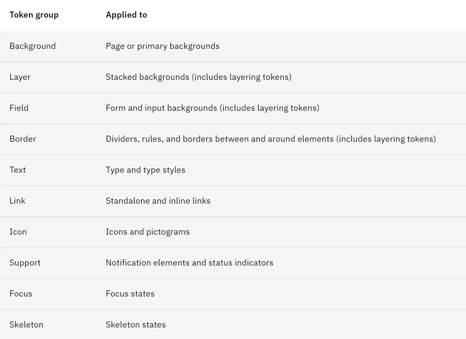
What I liked is that the system uses different tokens for different types of interface elements.
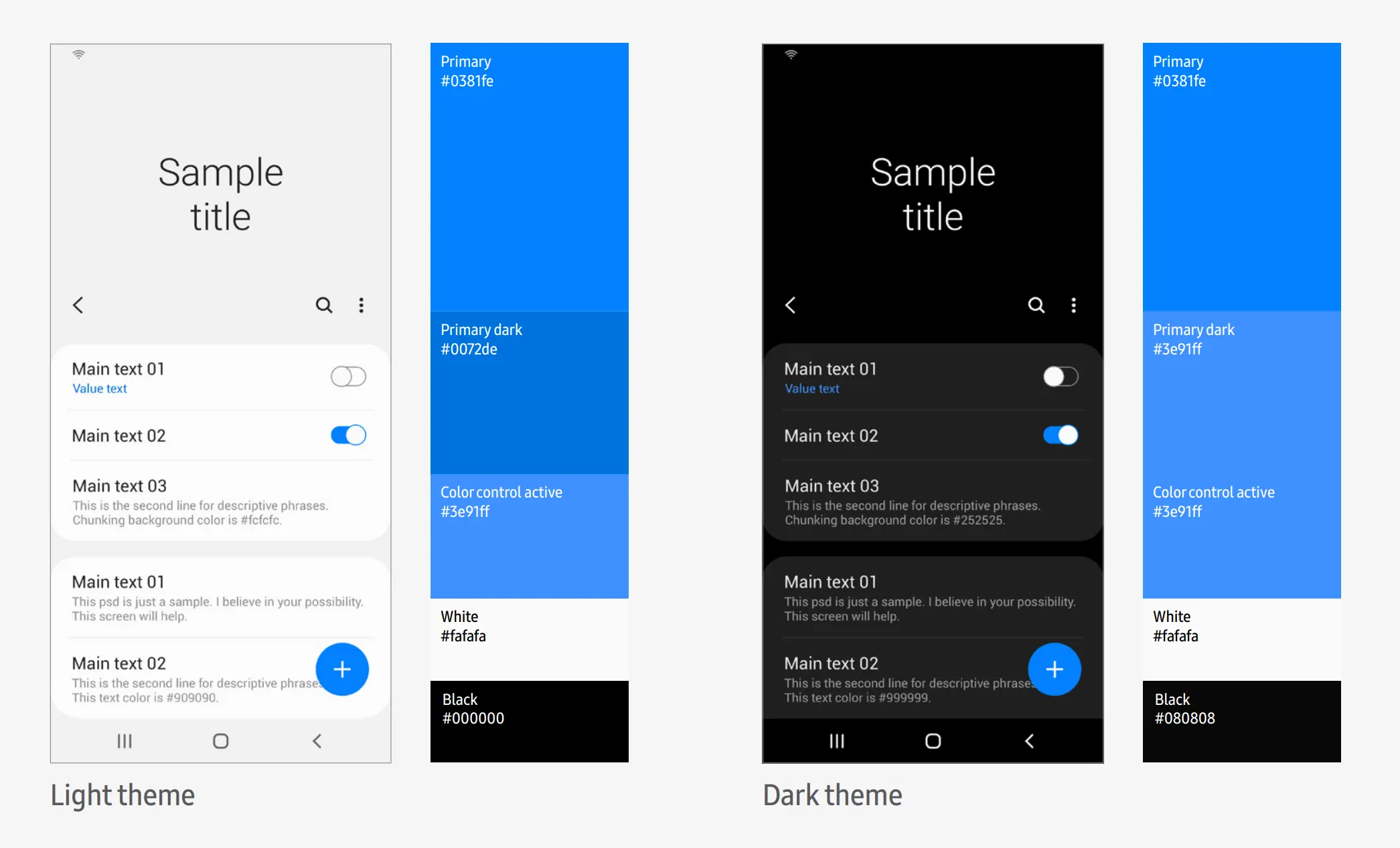
Samsung color design system
If you look at the Samsung brand colors, you can also see that there is a combination of dark blue and black. The dark and light theme in the design. And bright colors for infographics.
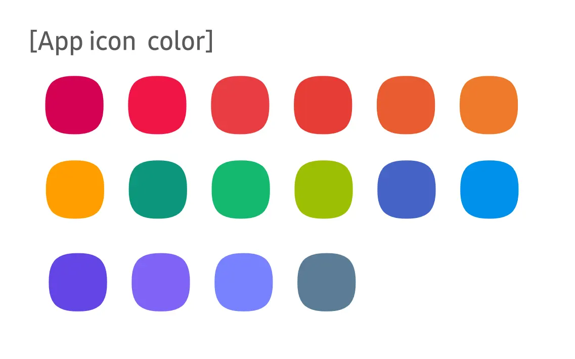
That’s what they write about colors for icons.
„For icons, choose colors that can reflect the app’s characteristics and apply a
a palette of colors that blend well for better uniformity.The colors applied to the application must be different from the colors applied to the icons.“
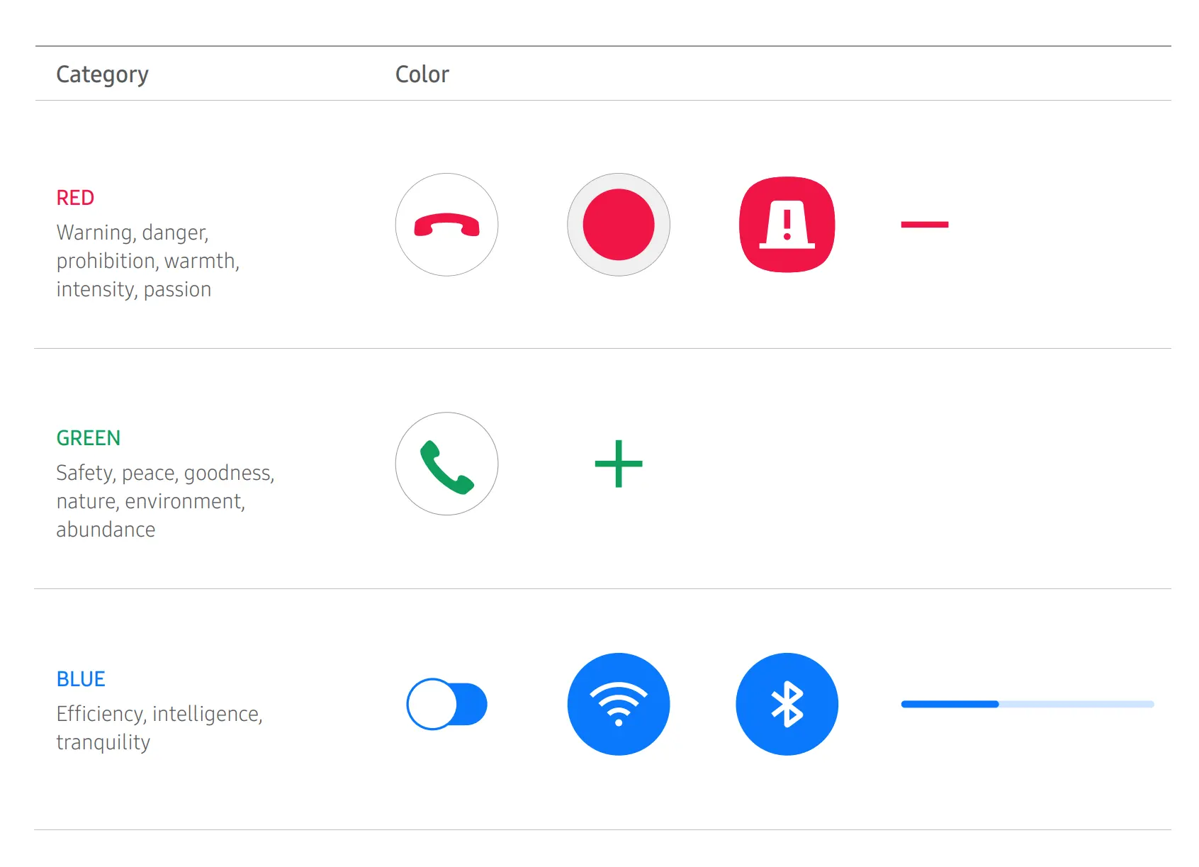
When using a color, it is important to understand its meaning and to which UI element you are applying these color characteristics.
Color usually carries both positive and negative meanings. You should also consider that some colors may have different meanings in different cultures.
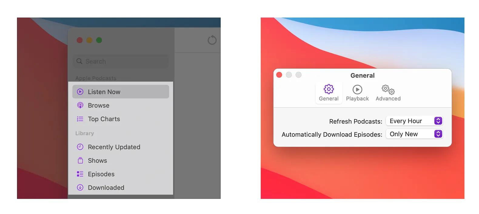
Apple color system
Apple’s color scheme is top-notch as always. Made different colors for different devices.
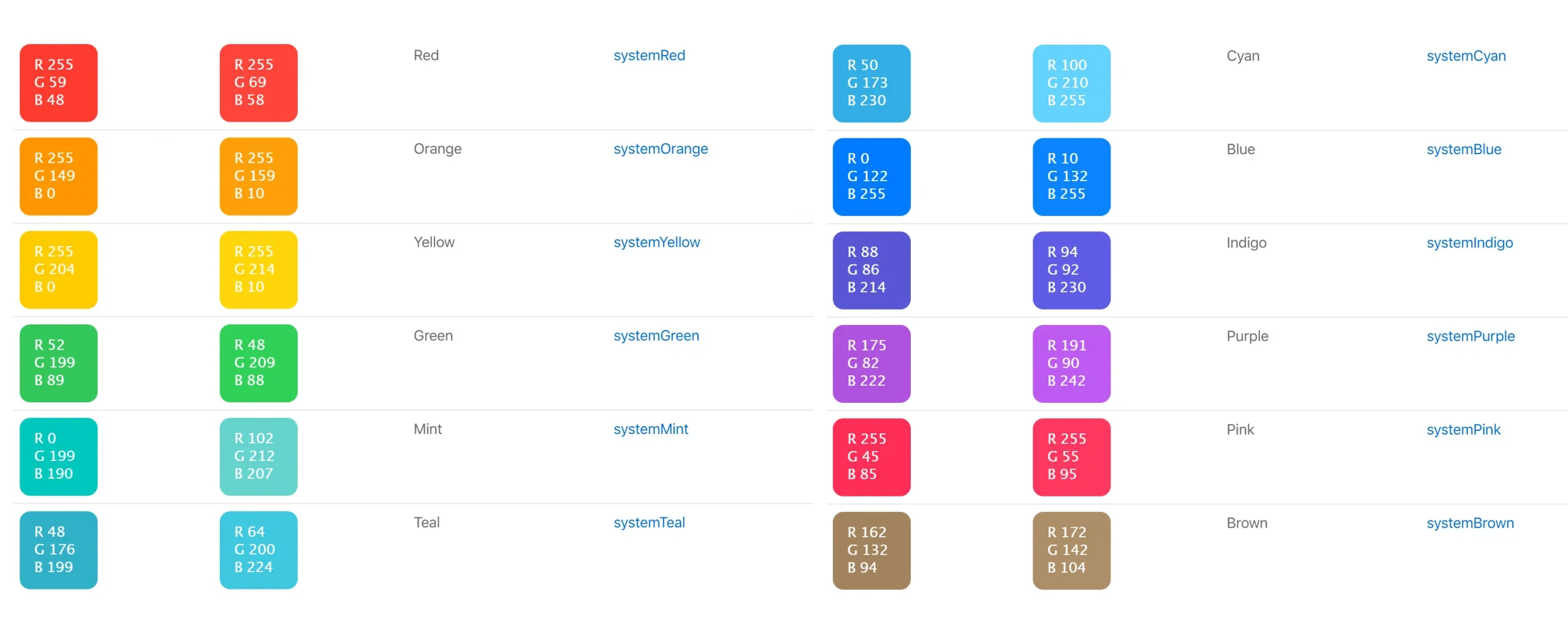 Starting with macOS 11, the system, like Android, uses the accent color to customize the appearance of your app’s buttons, highlight highlights, and sidebar icons.
Don’t just rely on color to distinguish between objects, indicate interactivity, or convey important information. When using color to convey information, make sure to present the same information in an alternative way that people with color blindness or other visual impairments can understand.
Intelligent use of color can improve communication, make your brand stand out, ensure visual continuity, convey status and feedback, and help people understand information.
A few years ago I wrote a jazz tune about monitor calibration. Choose colors with pleasure!
