Three terms are used to refer to the layout: container, row, and column.
Container – defines the general context of the grid at the top level and applies the correct margin and our default maximum width.
Row – defines a row of items in a grid – think of rows as wrappers around columns.
Columns define individual columns in a row.
Columns and rows create important lines for visual rhythm, especially for typography. Create columns by dividing the space into an even grid or by placing multiple fixed rectangles.
Grid and columns in Carbon Design
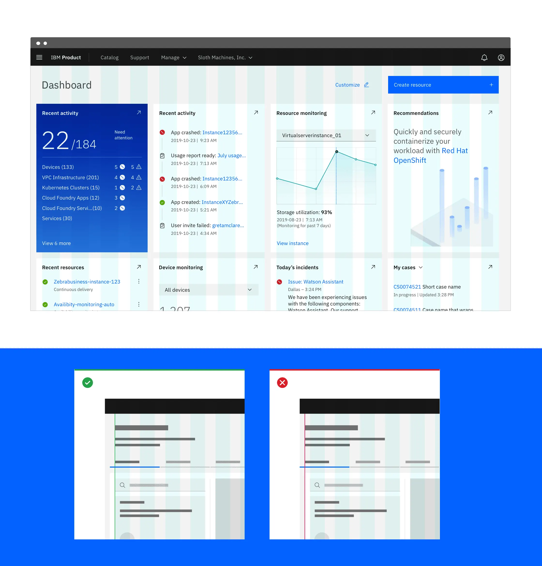
For measurements in the design, indents are used inside and outside the edges of the columns.
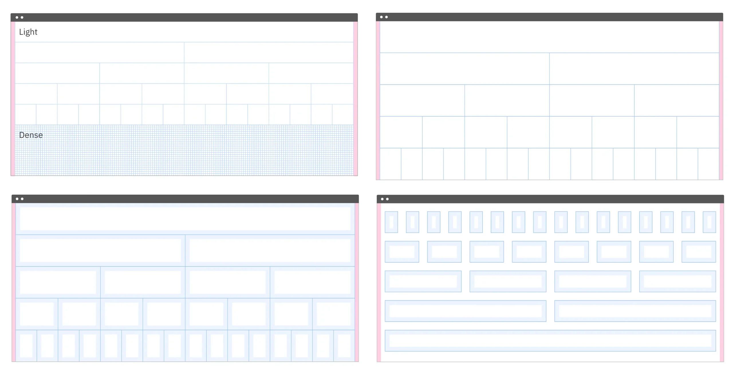 Carbon sketch templates are always drawn at 32 pixels, regardless of the control point. The default padding width is 32px because text inside or without a container should not be less than 32px indented. However, there are three different groove designs for containers and components: wide (basic), narrow, and compressed. These three link scripts provide typographic alignment that allows containers and individual components to „hang“.
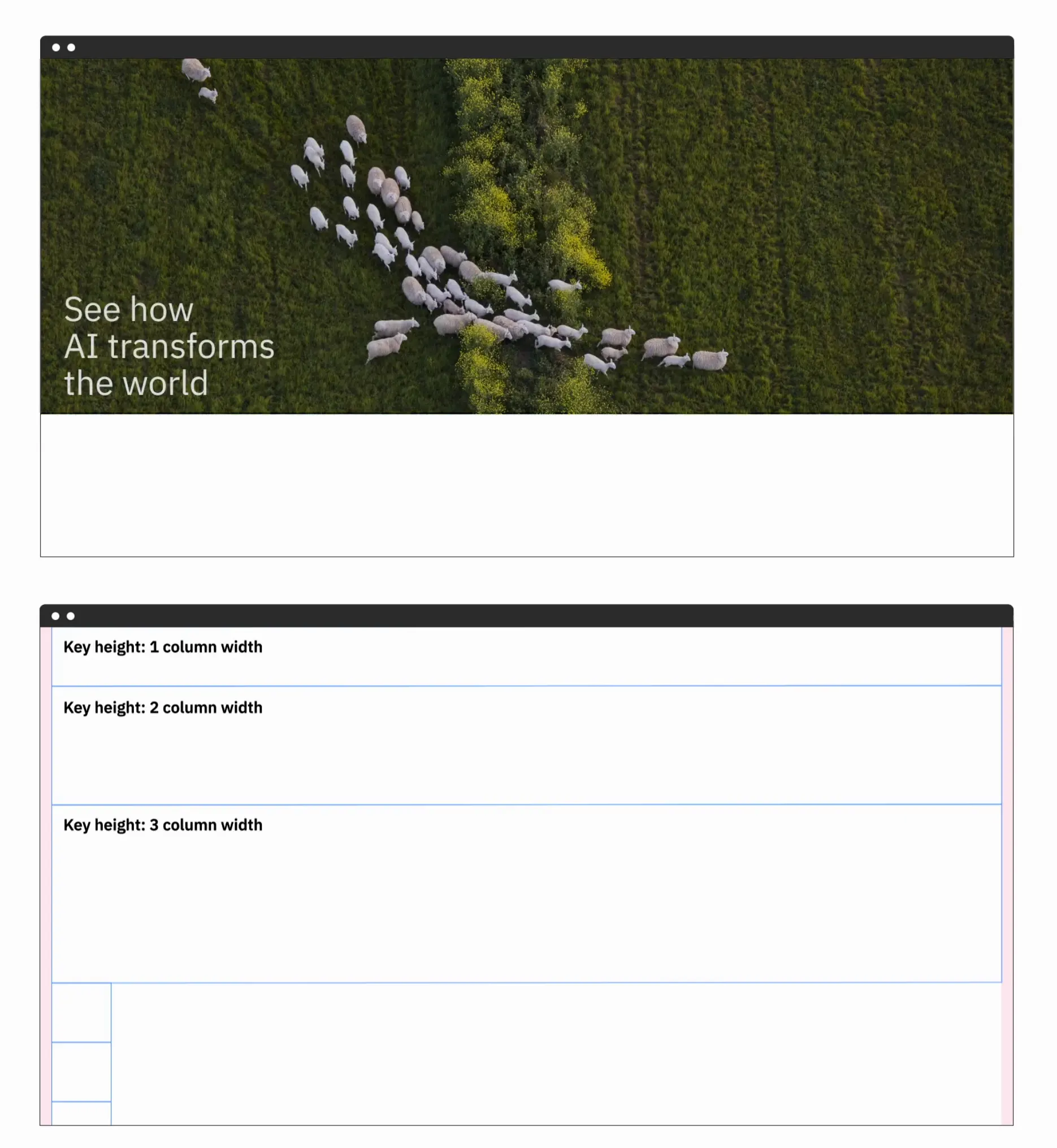
Continuity in column scaling is preserved in vertical form. Multiple 2 scales of the first column in height.
Lexicon Design System
Lexicon offers two types of containers: a fixed-width container and a flexible relative-width container.
Fluid container
The width of this container depends on the size of the viewable area.
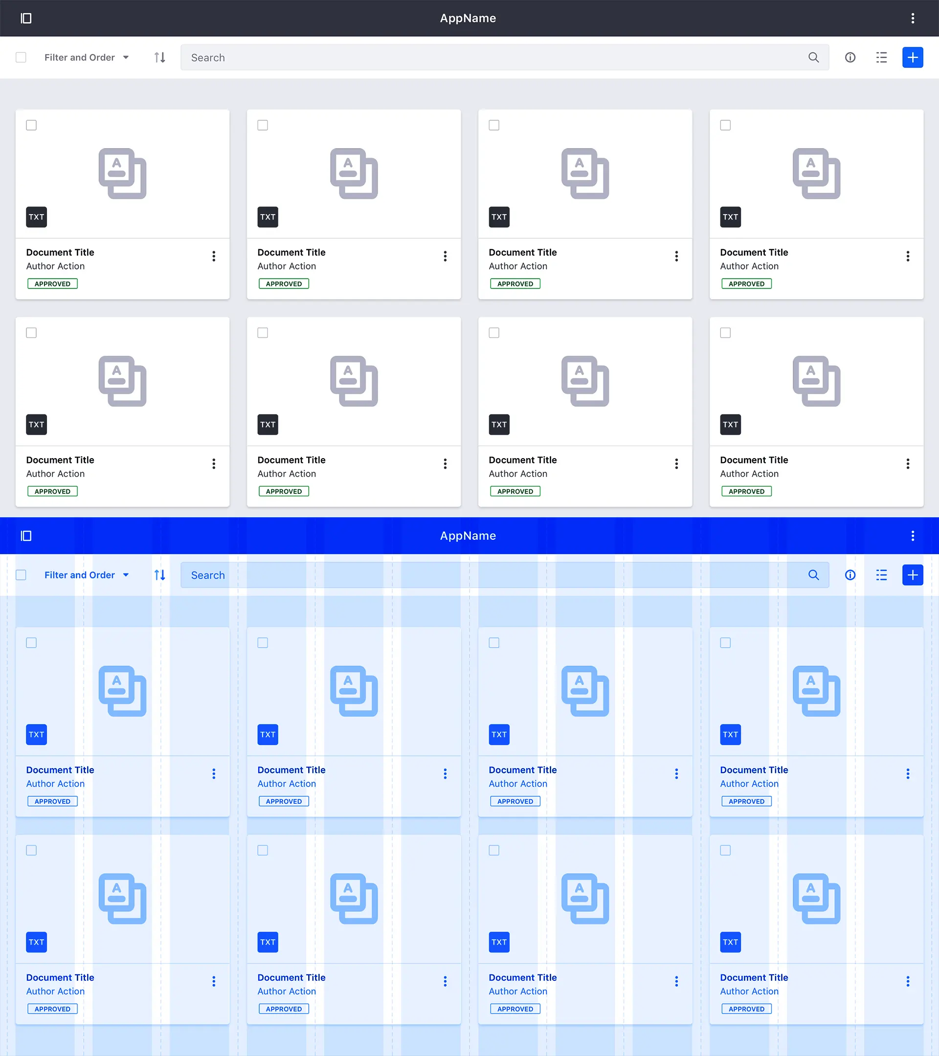
Fixed width containers
This container defines the maximum width. This value resizes the window based on predefined breakpoints.
![]()
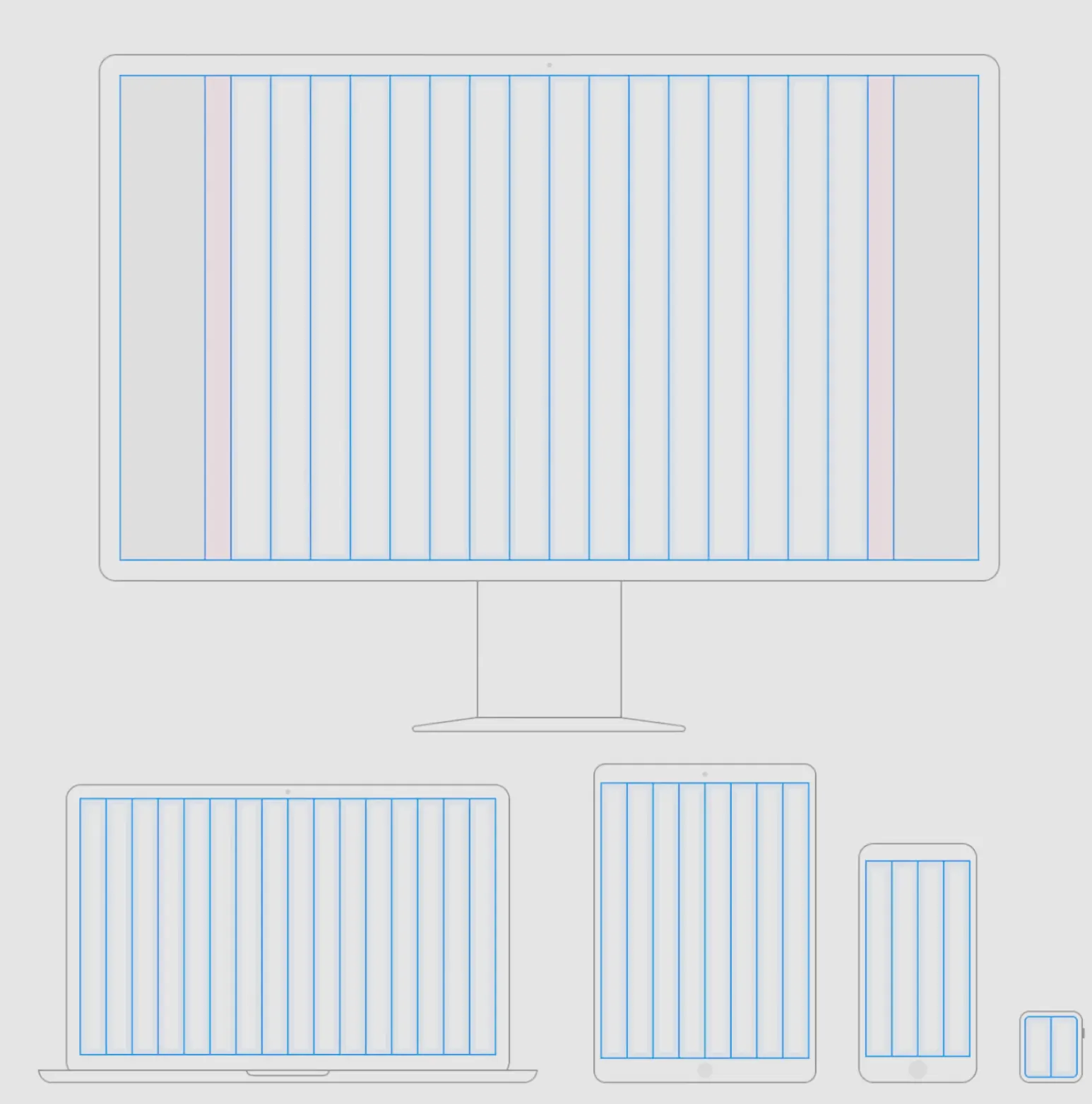
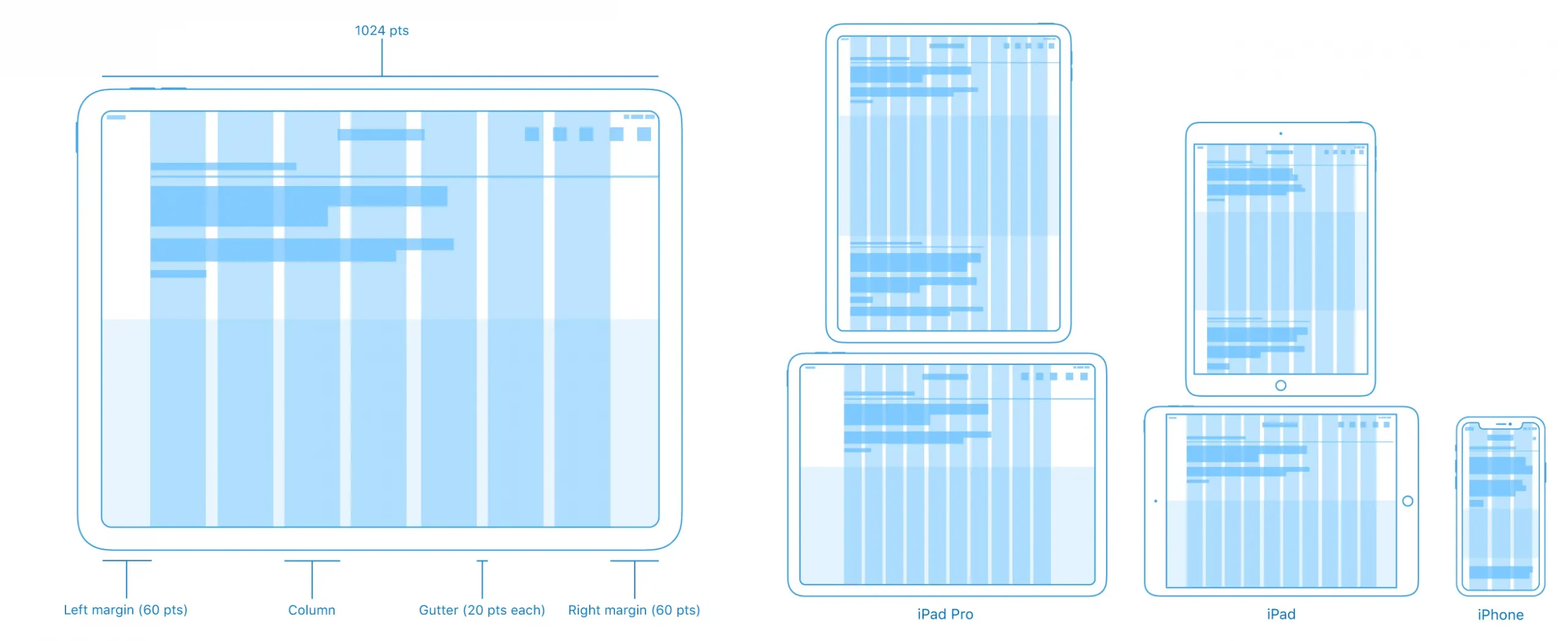
Apple column design layout
An example of the layout by columns in Apple.
Most modern design systems combine a fixed layout system with a flexible layout system.
